OVERVIEW
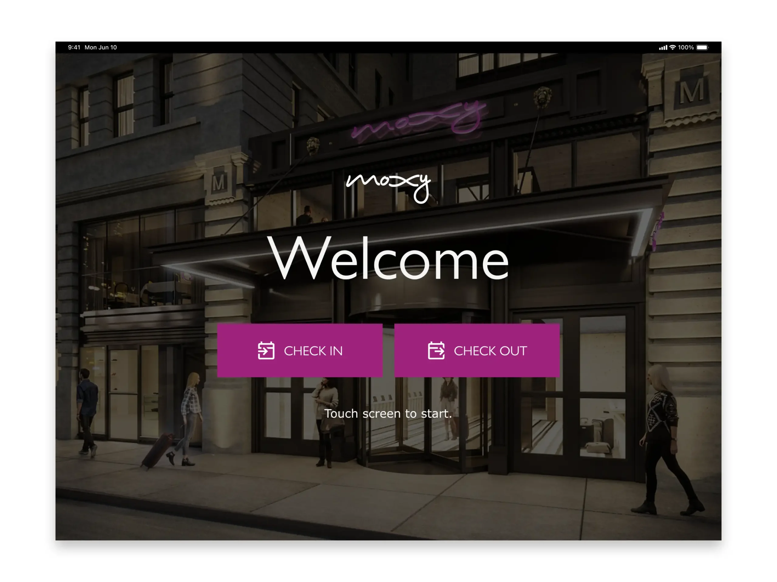
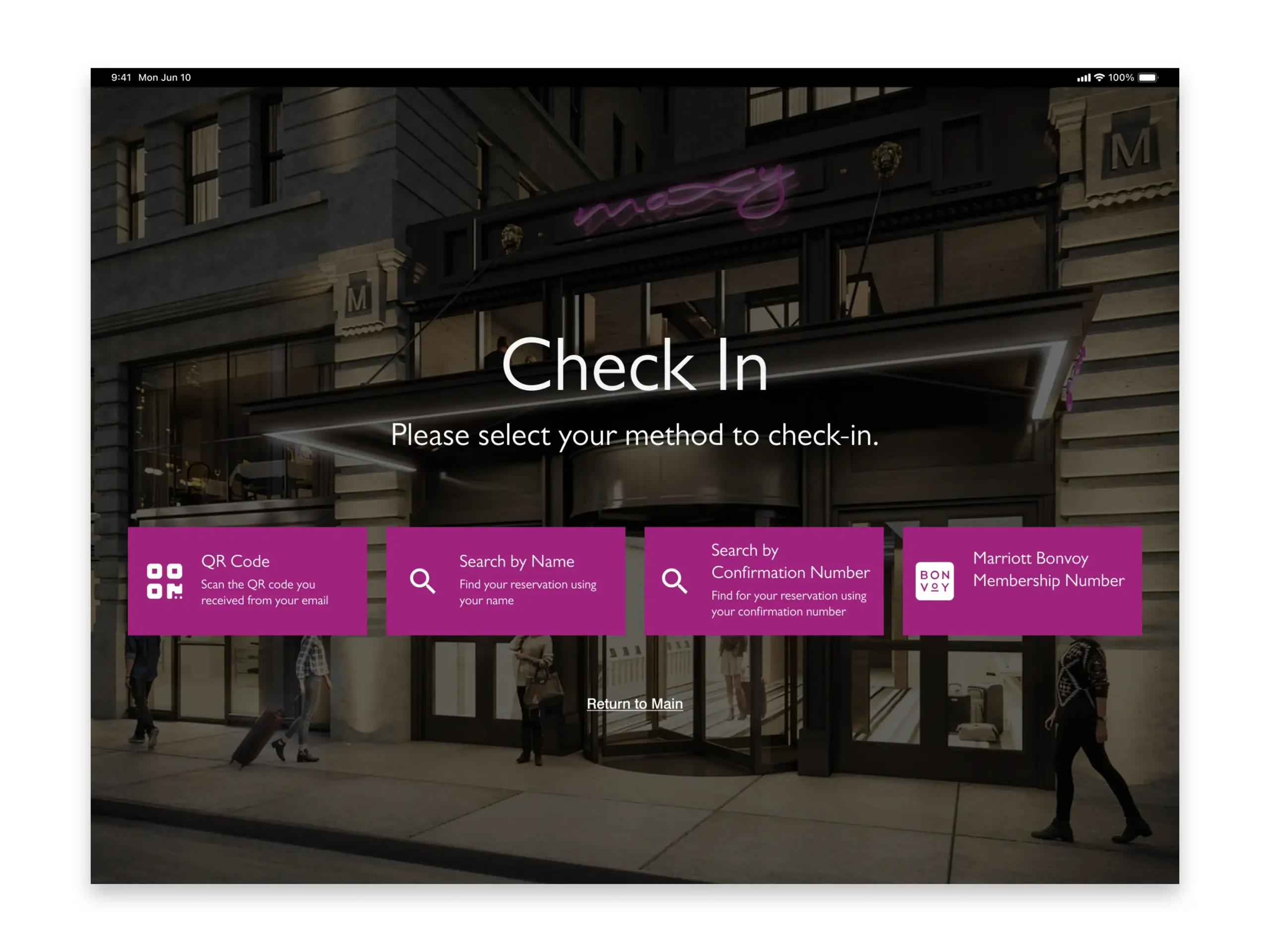
Marriott partnered with Zedwell to streamline check-in through self-service kiosks that let guests retrieve reservations, verify IDs, and encode room keys—reducing front-desk friction and speeding up arrival.
We inherited an outsourced kiosk tool that showed promise but didn’t meet Marriott’s usability or design-system standards. When the vendor declined to improve the experience, I led a cross-functional effort to redesign the key flows, align the UI to our enterprise patterns, and ensure accessibility and brand consistency.
The result was a clear, intuitive check-in journey that increased guest convenience, reduced associate workload, and created a scalable foundation for future kiosk rollouts.
THE CHALLENGE
Marriott partnered with Zedwell to introduce self-service kiosks that speed up check-in and reduce front-desk congestion. However, the outsourced kiosk tool we inherited didn’t meet Marriott’s usability, accessibility, or design-system standards. The vendor was unwilling to improve the experience or support our need to scale the interface across 30+ brands.
It quickly became clear that Marriott needed full control of the UX/UI to ensure consistency, remote management, and the ability to evolve the product based on real guest behavior.
THE SOLUTION
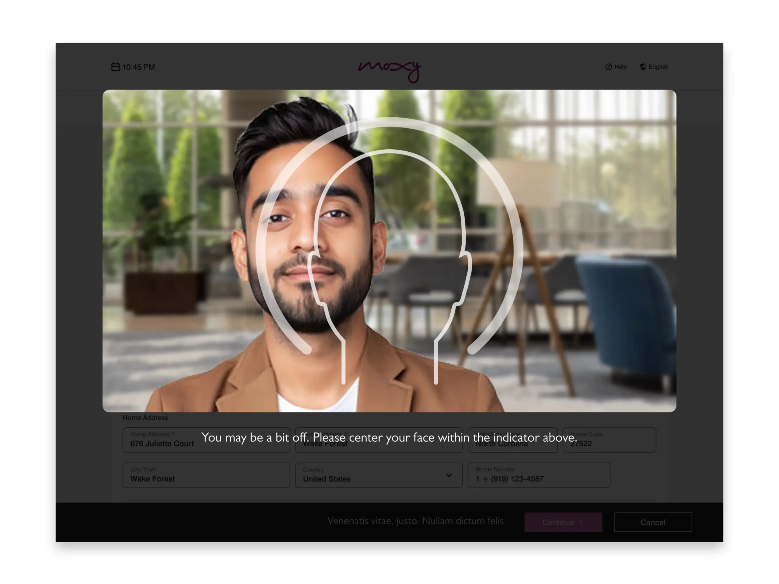
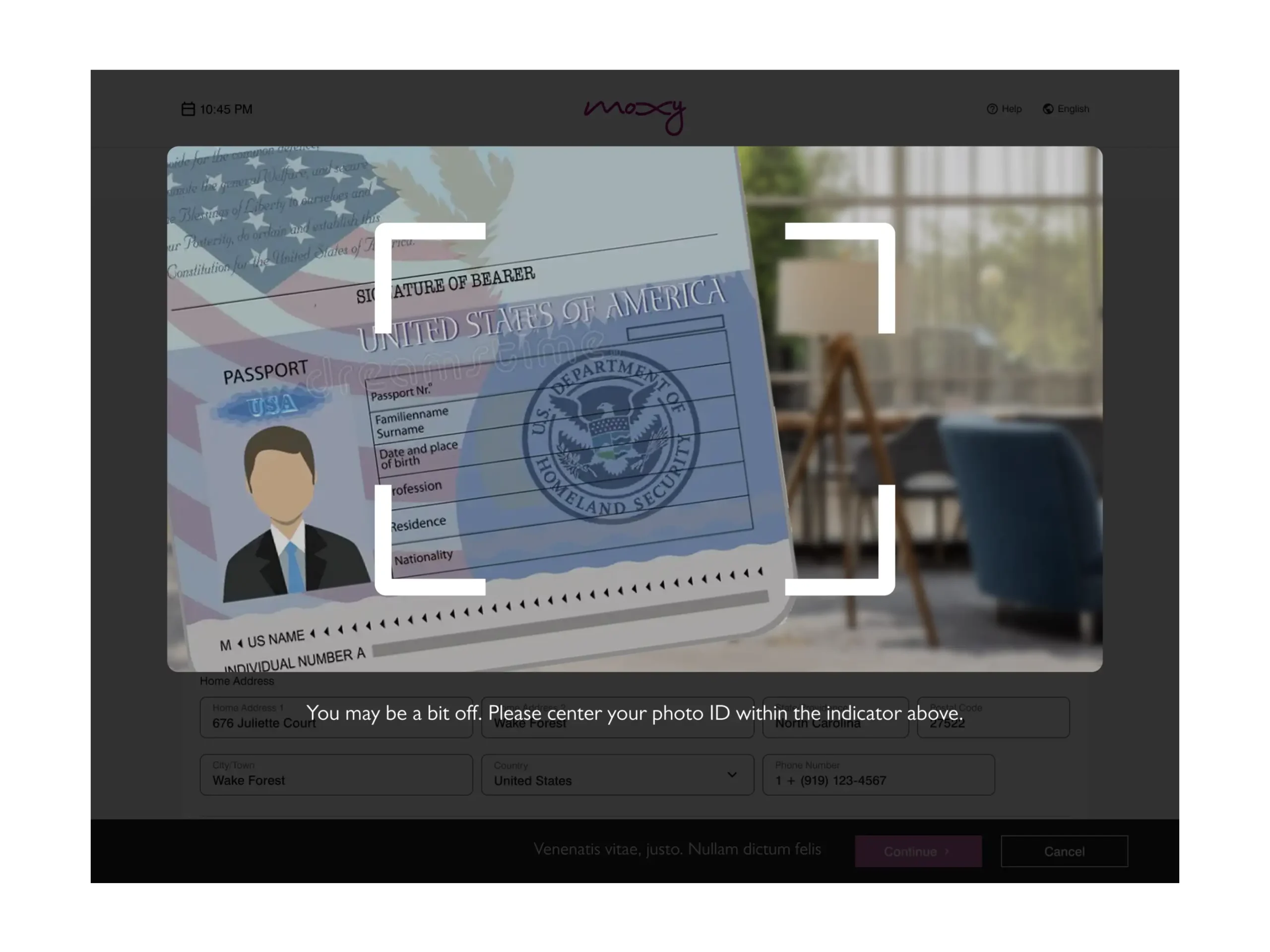
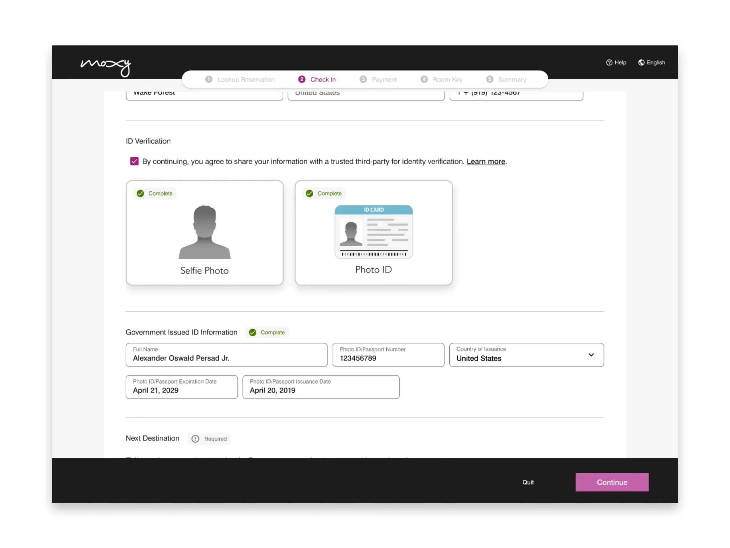
I led a cross-functional effort to redesign the kiosk experience and bring it fully into Marriott’s ecosystem. We rebuilt key flows, replaced inconsistent UI elements, and aligned everything to our enterprise design system so it could easily scale across all brands.
Using an agile approach, we partnered closely with product, engineering, and marketing teams to test and refine the experience based on how guests actually used the kiosks. By owning the UX/UI internally, Marriott gained the ability to update, manage, and expand the kiosk platform with brand consistency and operational efficiency.
Pain Points
"I travel to relax, not to stand in another line."
This moment was repeated across thousands of interactions — small frustrations, massive impact.

Long Wait Times
Traditional check-in processes cause delays, especially during peak hours, frustrating guests eager to begin their stay.

Limited Accessibility
Front-desk hours and language barriers can make it difficult for international or late-arriving guests to get the help they need.

Staff-Dependent Service
Booking amenities or upgrades often requires staff intervention, slowing service and missing upsell opportunities.

Outdated Experience Expectations
Today’s travelers expect digital convenience—24/7 access, touchless options, and personalized recommendations—features most hotels still lack.
Strategy & Approach
Previous vendor-led kiosk solutions revealed major gaps in usability and brand cohesion. The clear path forward was to bring the effort in-house—anchoring it within Marriott’s design system and brand strategy to ensure a seamless, consistent guest experience.
1. Discover & Align
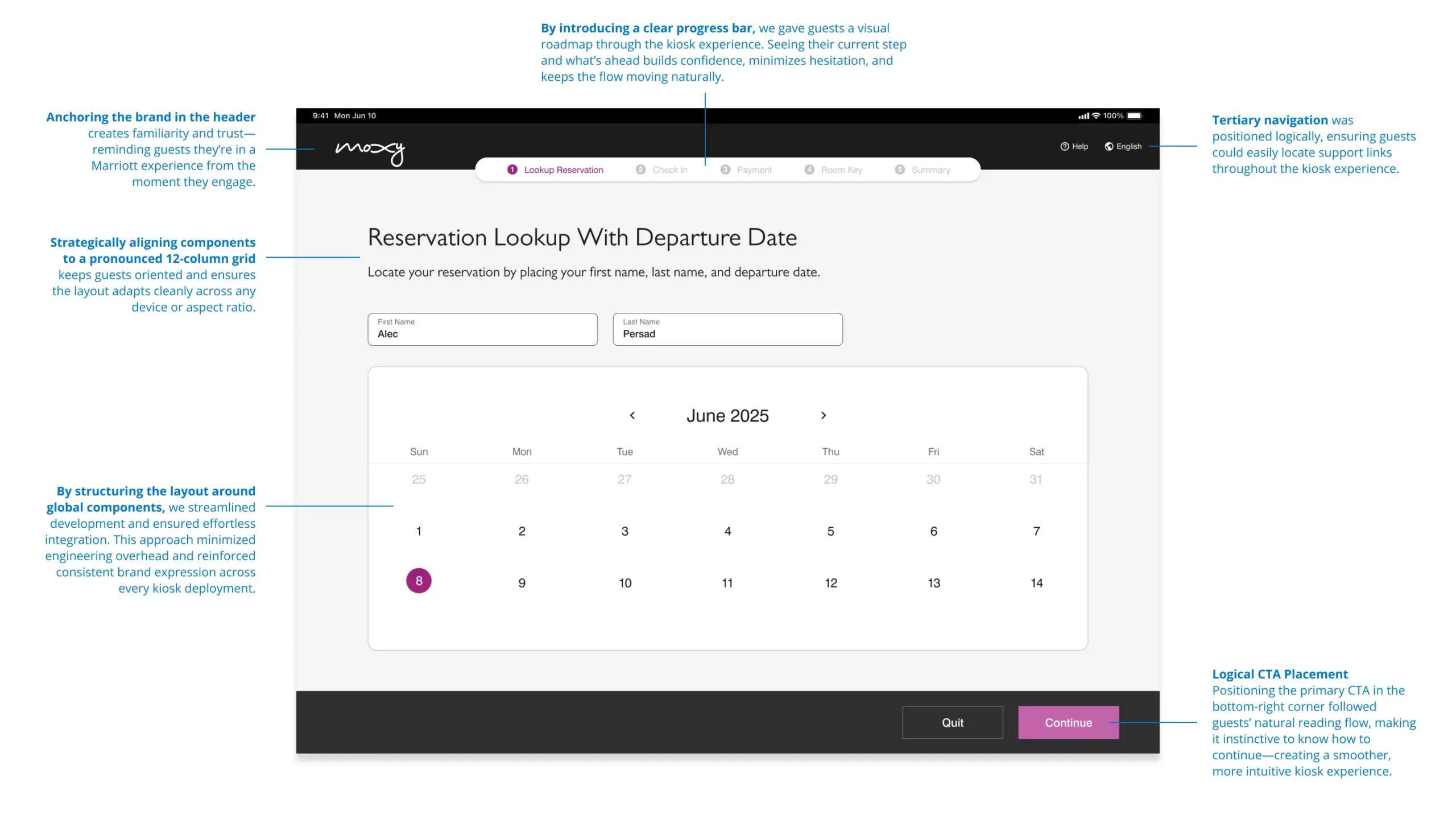
We conducted a rapid UX and accessibility audit revealing poor contrast, inconsistent navigation, and weak brand alignment. Cross-team workshops aligned on one goal: a kiosk experience as effortless and branded as the Bonvoy app.
2. Define the North Star
Our guiding idea became “self-service that feels like service.” Success meant enabling guests—especially international or late-arriving travelers—to check in quickly and confidently while still feeling Marriott’s signature warmth and trust.
3. Shape the Vision
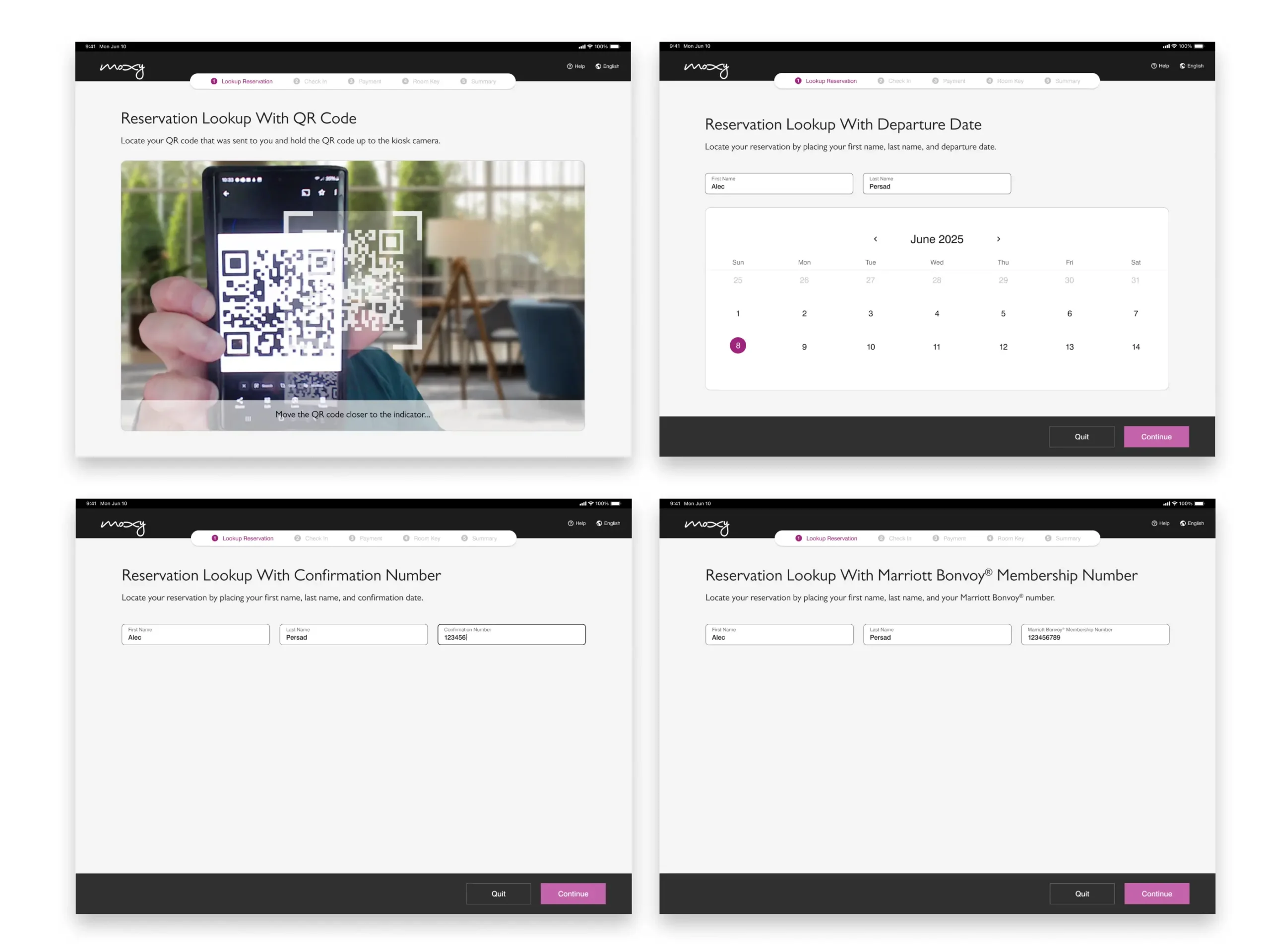
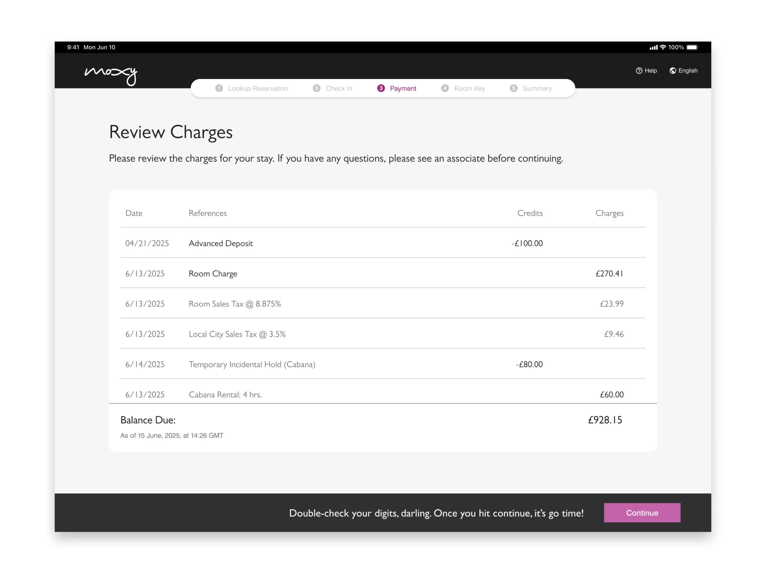
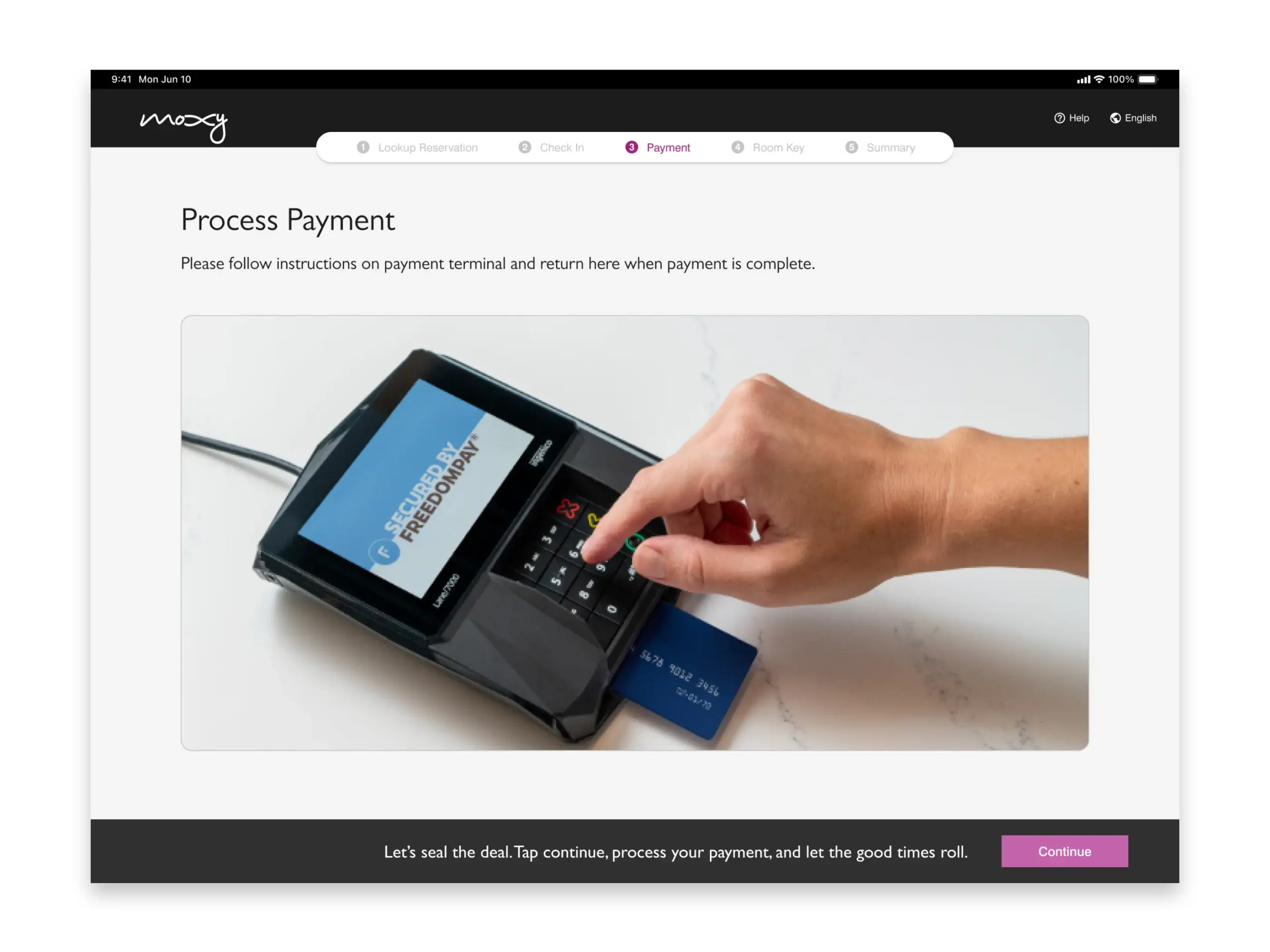
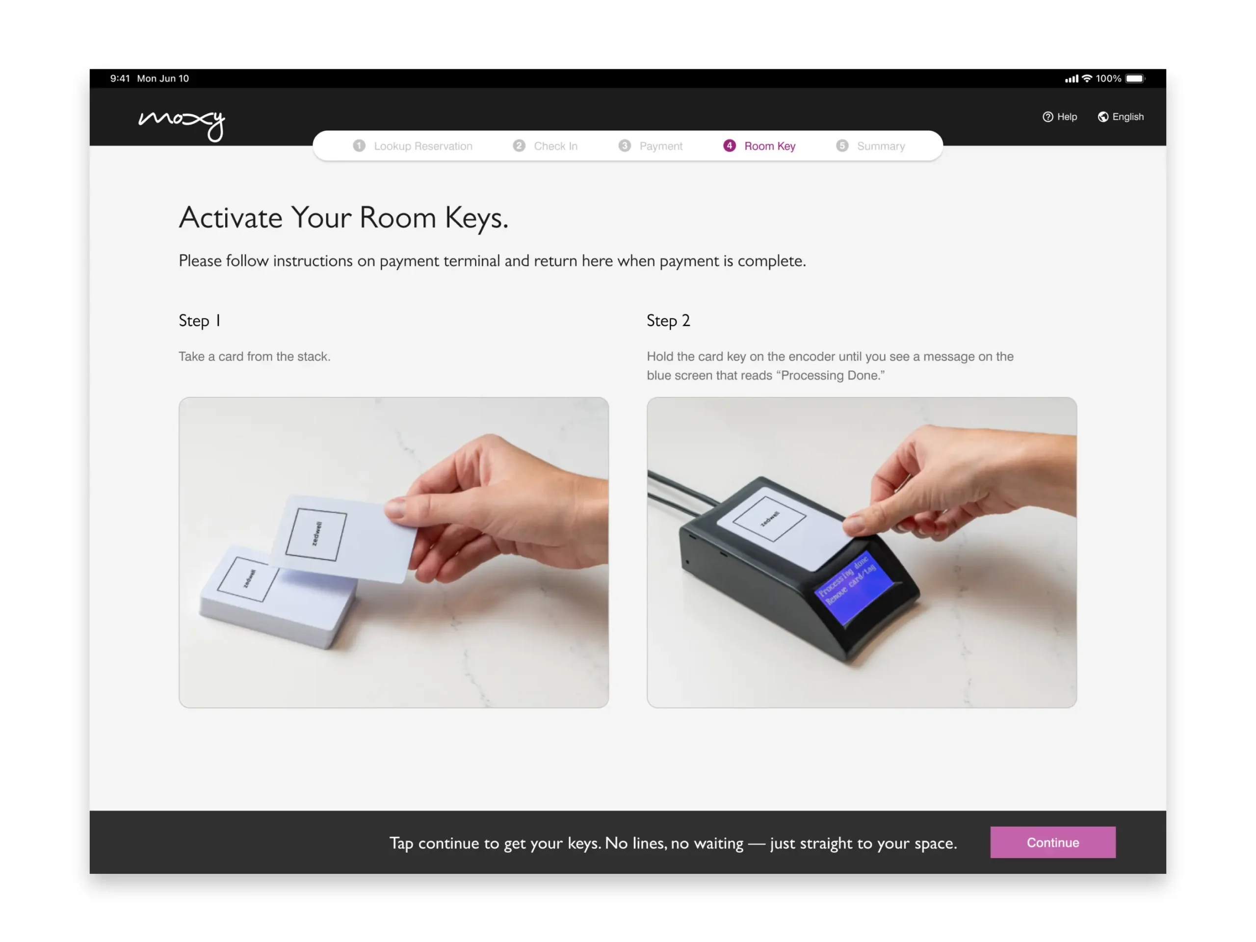
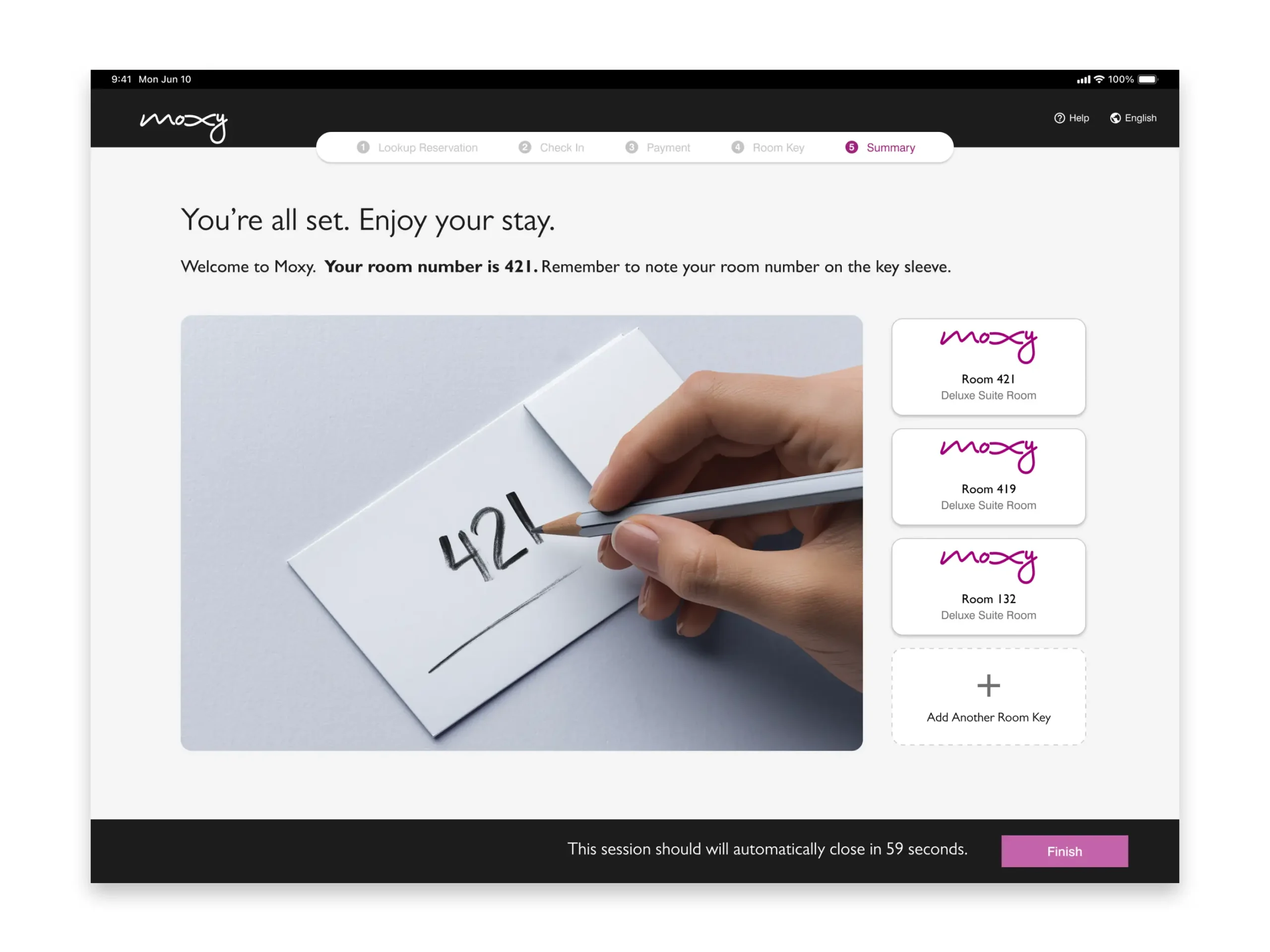
We mapped the guest journey from arrival to key issuance, replacing transactional steps with guided, conversational flows. Modular UI patterns and branded visuals brought cohesion to the interface and aligned it with Marriott’s digital design system.
4. Build Scalable Systems
We rebuilt the interface using Marriott’s design tokens and accessibility standards, ensuring parity with the mobile and web experiences. A reusable component library and documentation enabled future expansion and reduced vendor dependency.
5. Collaborate & Integrate
Cross-functional teams across engineering, brand, and operations helped transition the work in-house. Iterative prototypes were tested at real properties, capturing guest feedback and refining key flows.
6. Scale & Evolve
With a strong foundation in place, we extended the design to include loyalty enrollment, amenity upsells, and multilingual support—establishing a flexible platform for future AI-driven personalization.
Key Design Decisions
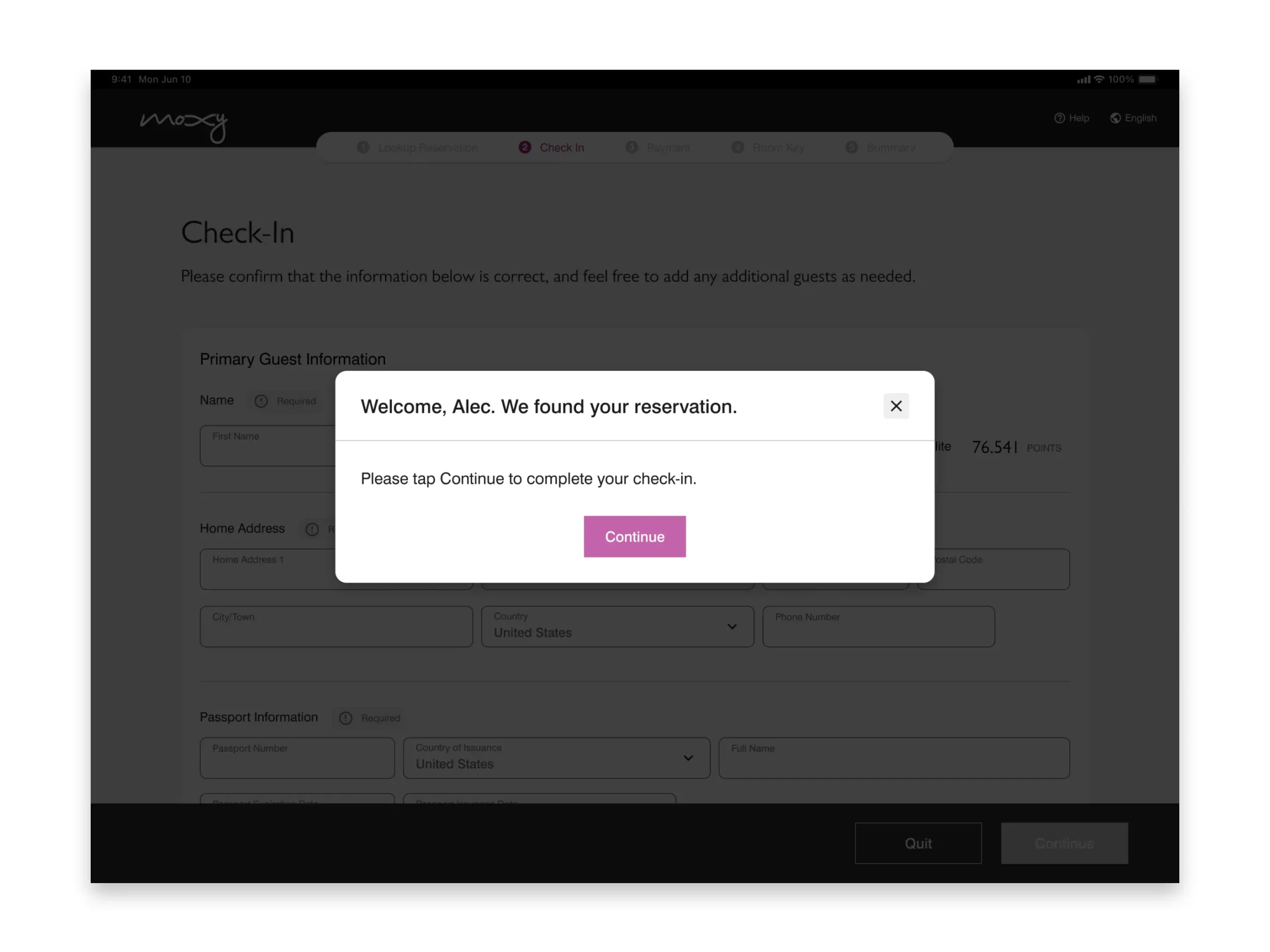
ORIGINAL KIOSK UX: First, We Untangled the Mess
Before improving the experience, we first had to detangle the vendor’s original design—an overly complex flow filled with inconsistent layouts and unclear interactions.
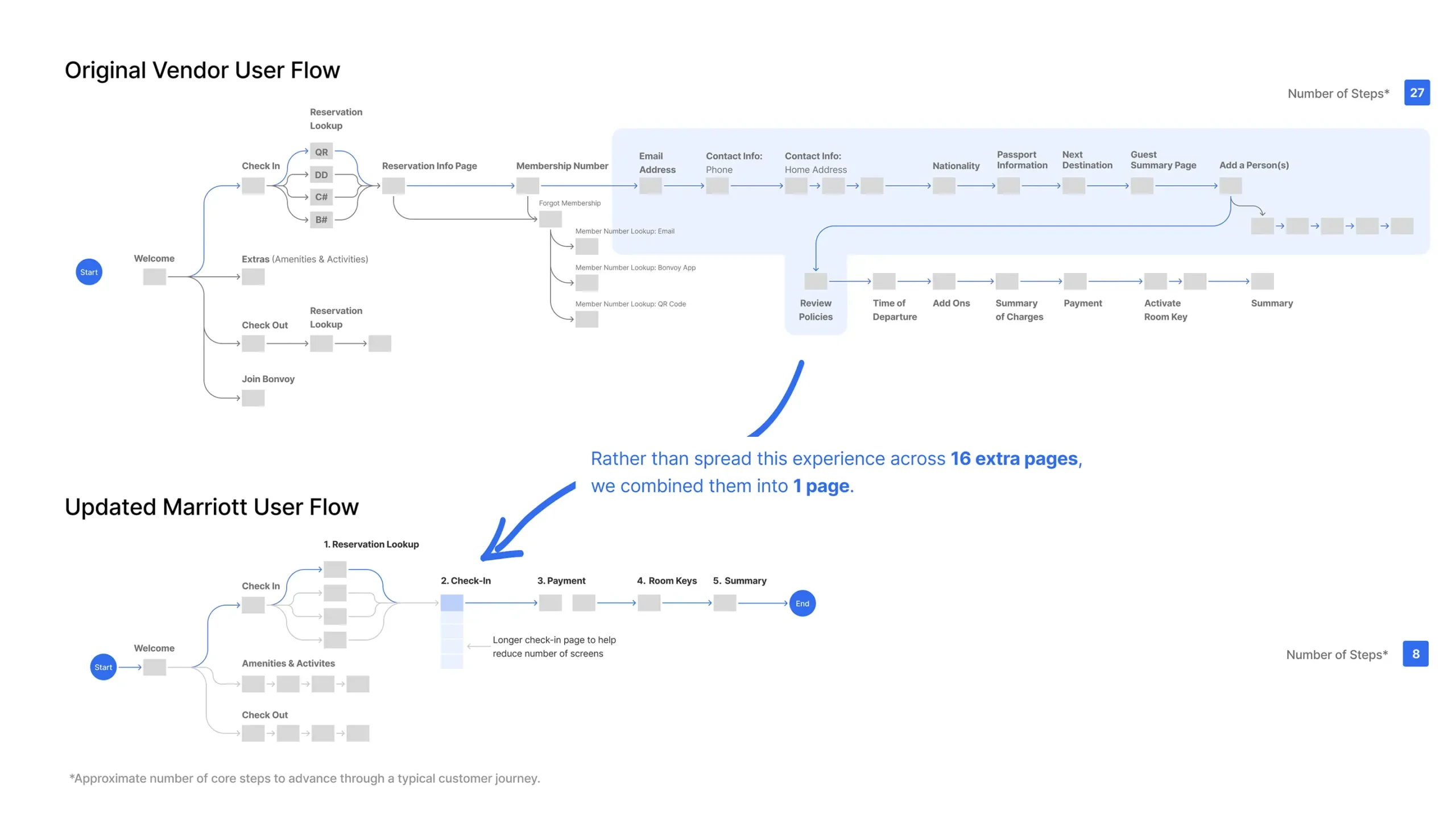
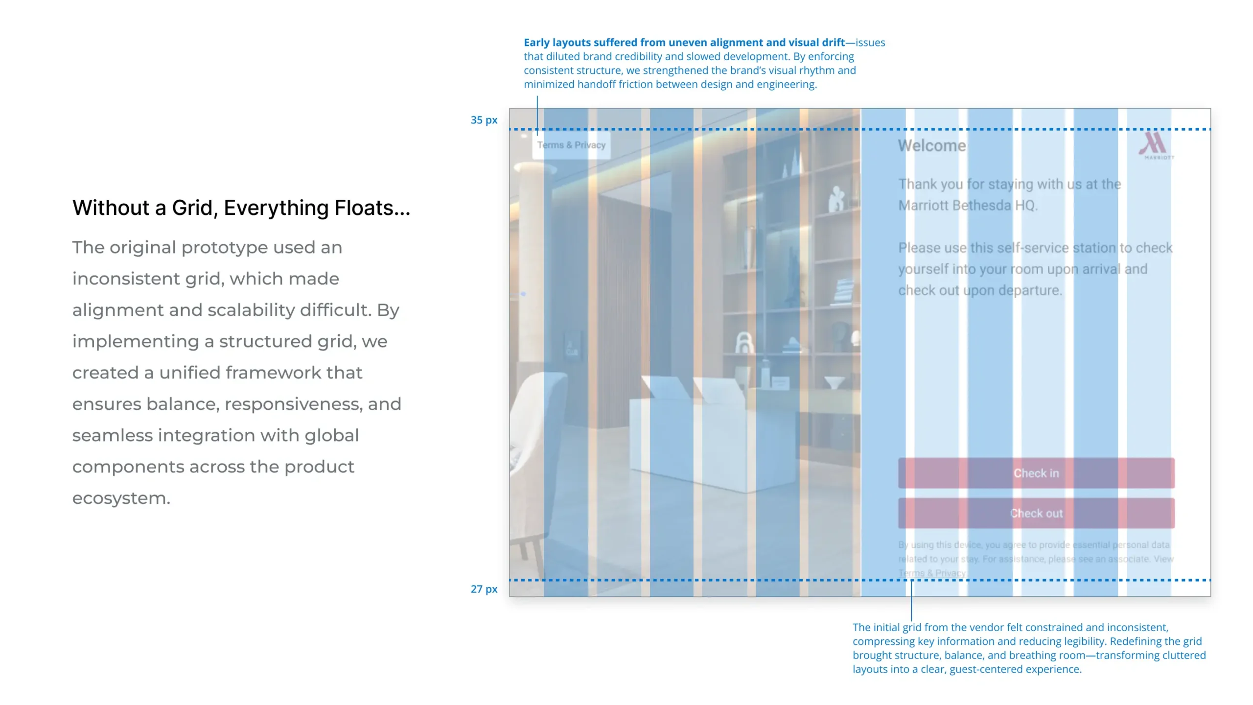
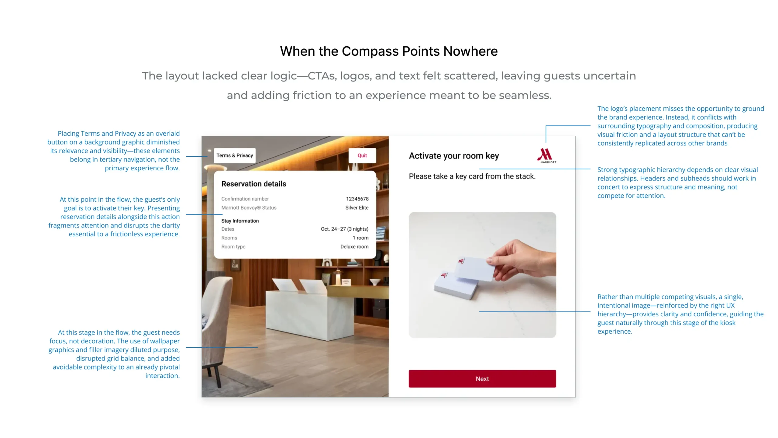
UPDATED UX: Clarity Out of Chaos
The original kiosk experience was cluttered and confusing—buttons competed, instructions overlapped, and the flow left guests uncertain of what to do next. Our first step was to untangle the vendor’s lengthy user journey and rebuild from the ground up.
By re-establishing a clean 12-column grid, clear hierarchy, and consistent spacing, we transformed confusion into confidence. Good layout became the quiet hero—organizing complexity, reducing friction, and creating a calm, intuitive check-in experience that felt unmistakably Marriott.