OVERVIEW
Forever 21 is a multinational fast fashion retailer founded in 1984 as Fashion 21 in Highland Park, Los Angeles. It sells clothing, accessories, beauty products, and home goods for women, men, and children, known for trendy offerings at low prices. In 2019, it filed for Chapter 11 bankruptcy protection, allowing time for restructuring and developing an ecommerce platform. I led the product team in evolving the Website and App to compete with other fast fashion businesses in the space.
Case Study Index
We did a lot over a period of 18 months at Forever 21. I’ve placed a quick jump link index below. Feel free to jump ahead, scroll, or contact me if you have any questions.
The Challenge
Big Goals. Bigger Opportunities.
Discovery
Picking Up the Pieces
Early Insights from the Field
Working Backwards from Perfect
Design System and Components
Wait, Do We Have a Design System?
Way Too Much Stuff
Priority Initiatives
Forever 21 App
Navigation
Onboarding New Customers
Discovery Page
Let me See the Products, Please
Forever 21 Website
Mobile-First Changes Everything
Search Gets Top Billing
What’s on the Menu?
Ya Down With PDP?
Checkout
Working From inside a Black Hole
Salesforce Checkout Limitations
Ya Down with MVP?
The Impact
KPIs
Customer Satisfaction
THE CHALLENGE
BIG GOALS. BIGGER OPPORTUNITIES
Main Goal: Build a customer-centric product team for an amazing customer experience, address clunky sales funnel with cross-department collaboration, and utilize our effective team to make it all happen.
Supporting Goals
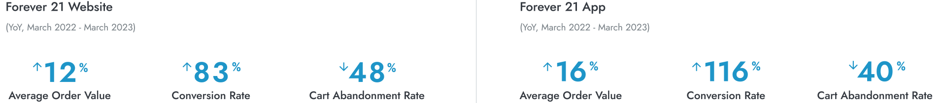
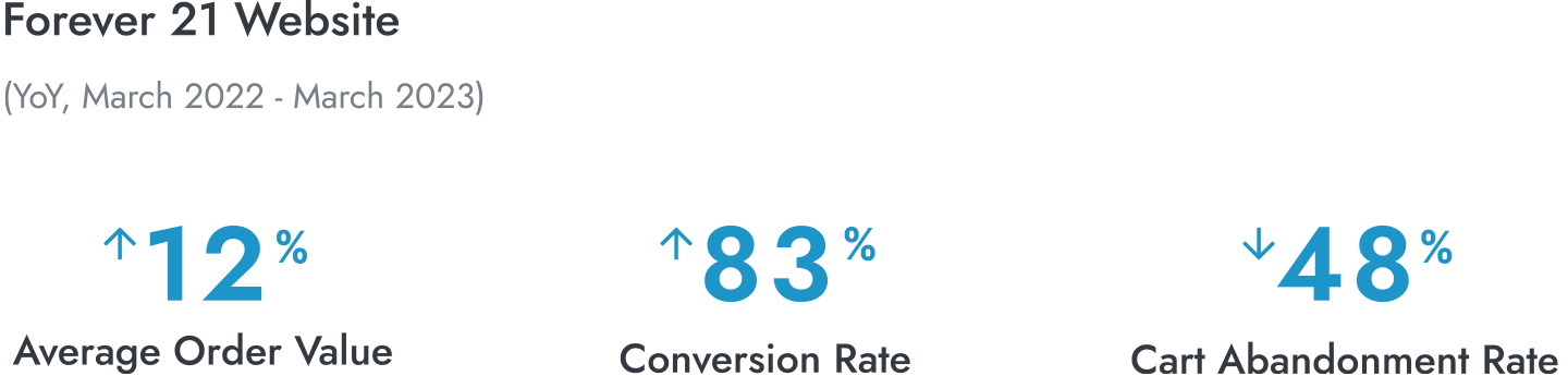
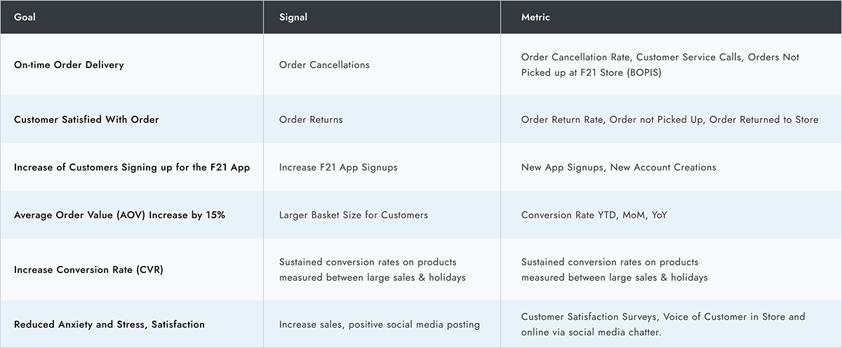
Focus on high-value KPIs to gauge customer response and quantify our assumptions. AOV, CR, CAR, and Website Traffic drove our product roadmap.
Elevate Forever 21 to a premium brand with attention to quality aesthetics to compete in the fast-fashion market.
Create a brand-promoting Design System for a seamless customer journey across digital channels.
Prioritize speed and ease of use for all users, everywhere.
Craft mobile-first experiences, acknowledging the significant portion of digital sales from mobile devices.
Treat app customers as royalty with better experiences, exclusive deals, and extra appreciation for their loyalty.
My Role
In fall 2021, I joined Forever 21 as Sr. Product Designer, leading UX Design, UX Research, and UI Design efforts for both web and app. I collaborated with Product Managers, Business, Marketing Executives, and C-suite leadership to shape the product roadmap.
In the spring of 2022, I became Director of Experience, overseeing the product management team and working closely with Business and Marketing Sr. leadership. Throughout this role, I served as the lead creative resource using tools like Figma and Adobe Creative Suite. The team remains strong, and they have exciting improvements coming soon.
DISCOVERY
LET'S GET STARTED
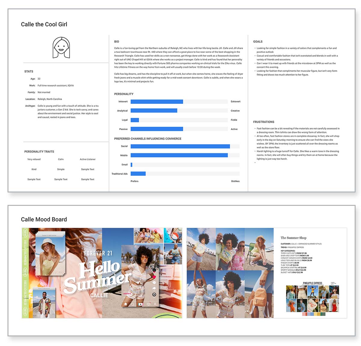
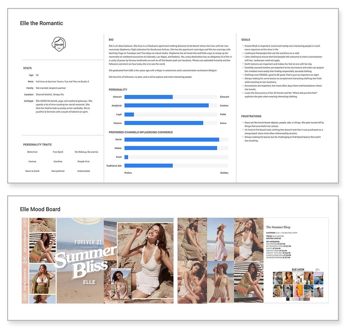
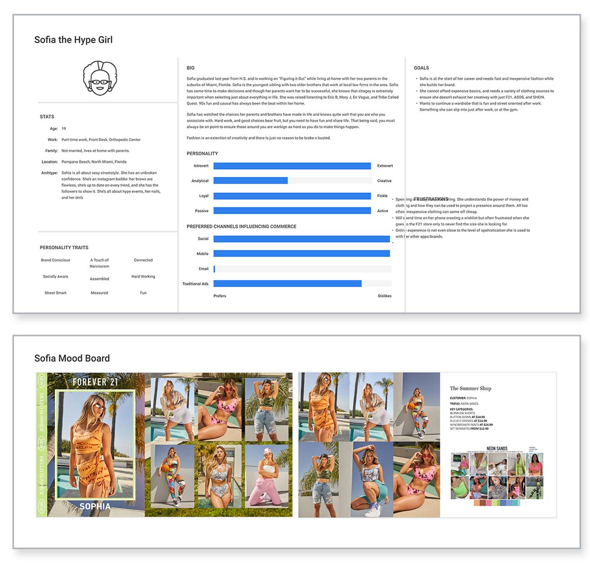
The project had some of the infrastructure in place so we focused on defining the mission, goals, a clear Customer Journey Map, personas, and UX research. I collaborated with product managers and interviewed real customers to understand their experiences.
DISCOVERY
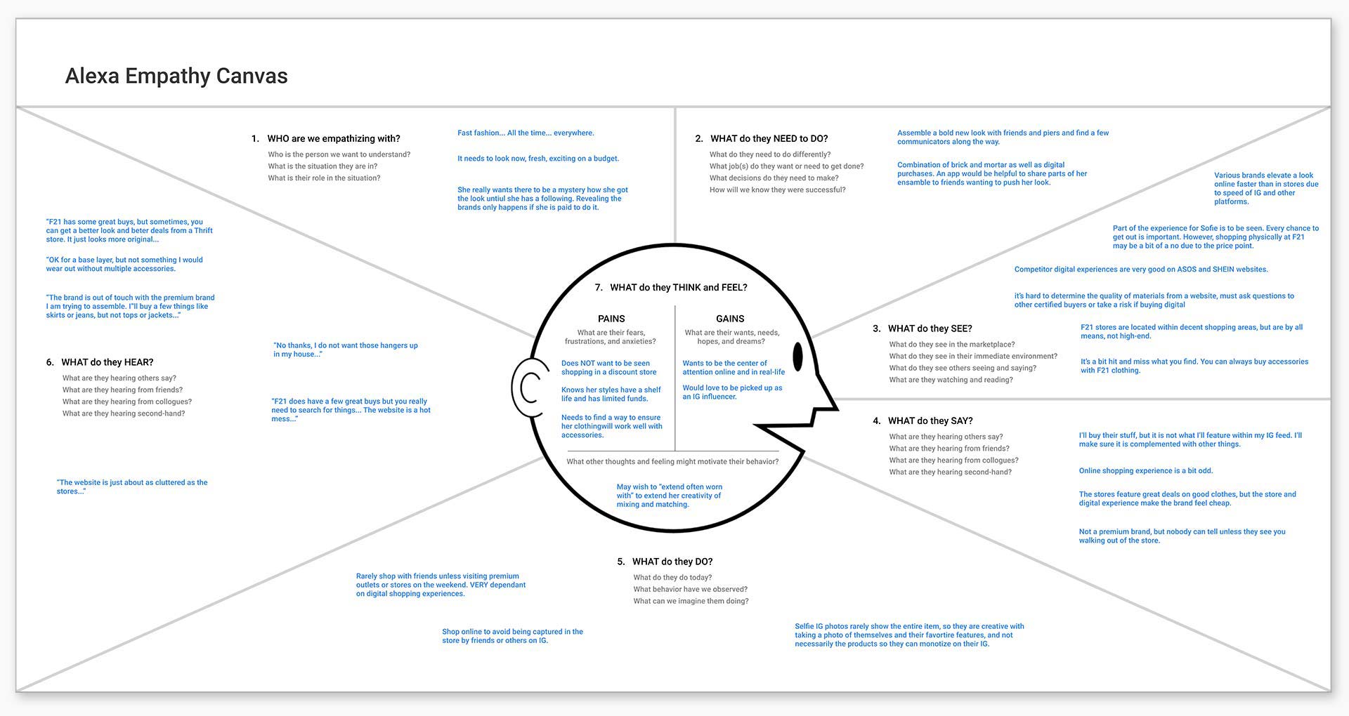
EARLY INSIGHTS FROM THE FIELD
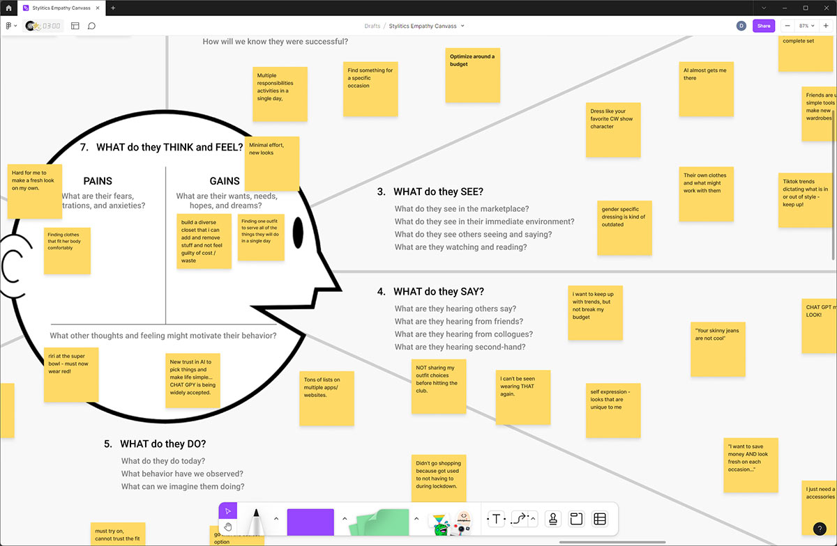
When learning about a product, I always do an empathy canvas with real people using Dave Gray's Empathy Canvas. It emphasizes "Think and Feel" elements inside the head, distinguishing them from observable phenomena. "Pains and Gains" are summarized for Product, Business, and Marketing teams. One common thing I heard was...
“The experience is just really bad. It feels like I’m using a lame website/app from like 20 years ago when people were just starting to figure out online shopping... It’s really hard to use...”
In essence, customers liked Forever 21 products and brand but faced multiple online user experience issues. They preferred competitors due to the friction on the web and app channels.
Empathy Canvas Discoveries
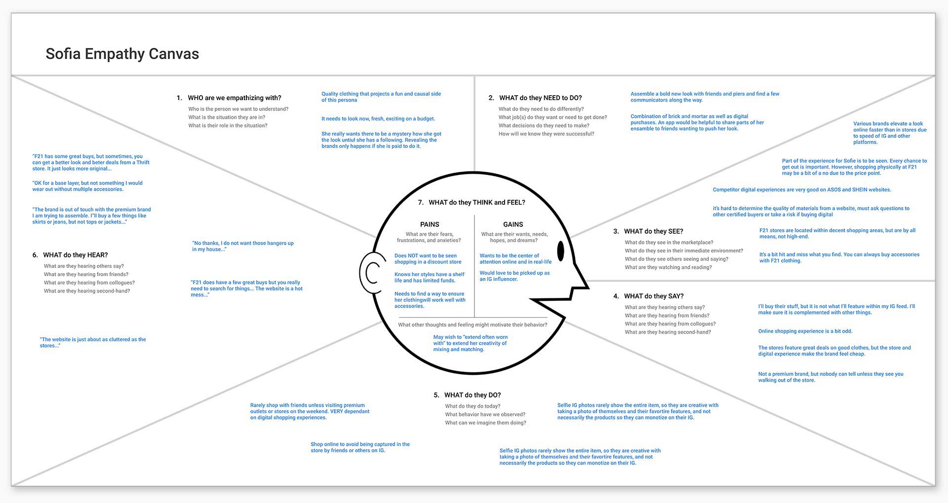
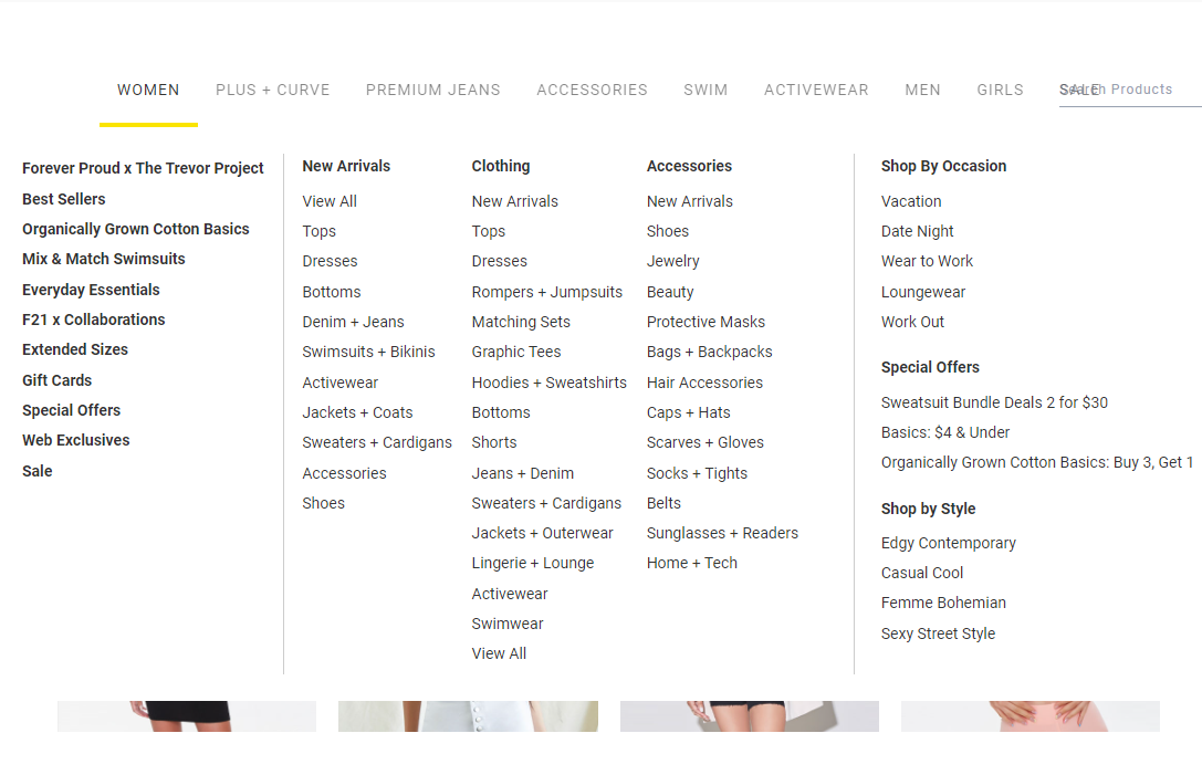
Hard to Find Things in the Navigation
The Forever 21 Website and App had a large, challenging taxonomy due to SalesForce Commerce Cloud constraints and quick fixes made during COVID, leading to customer disorientation and dissatisfaction.
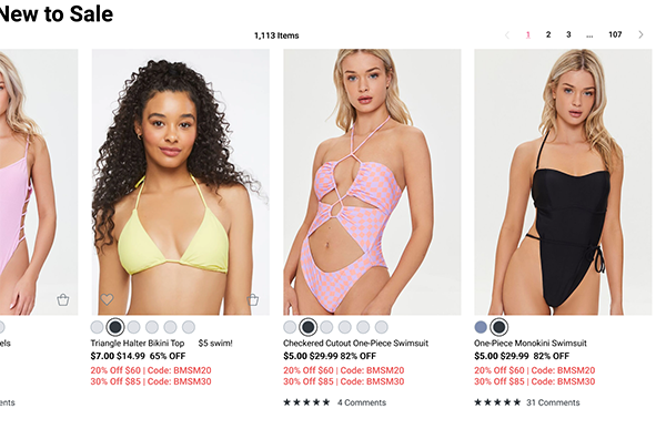
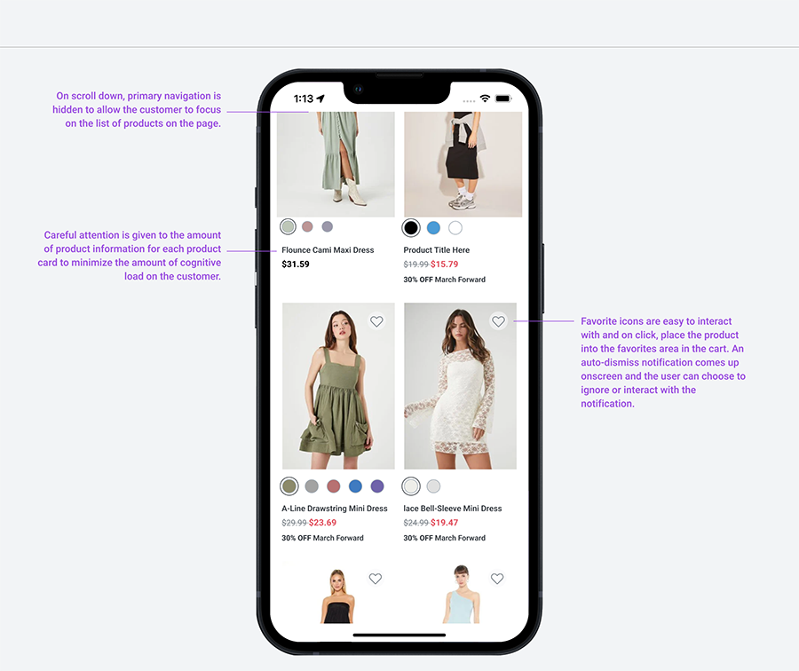
Way too much information on product cards
Customers complained that there was just way too much information shoved into the product card area. Small photos, large color buttons, and conflicting sales offers added too much cognitive noise for customers. It just turned them off.
DISCOVERY
WORKING BACKWARDS FROM PERFECT
Before designing, defining success and understanding the online shopping experience at scale was crucial. Most customer issues were at the end of the checkout process (PDP, Checkout, Order Notification). I had to walk through the post-sale experience and backtrack through the sales funnel before the redesign.
DESIGN SYSTEM AND COMPONENTS
WAIT, DO WE HAVE A DESIGN SYSTEM HERE?
For an established brand, embracing a design system throughout the organization is a major challenge. After the 2019 bankruptcy, Forever 21 lacked a formal style guide for digital products. We focused on the basics, following Atomic Design principles, as they can take care of everything when done right.
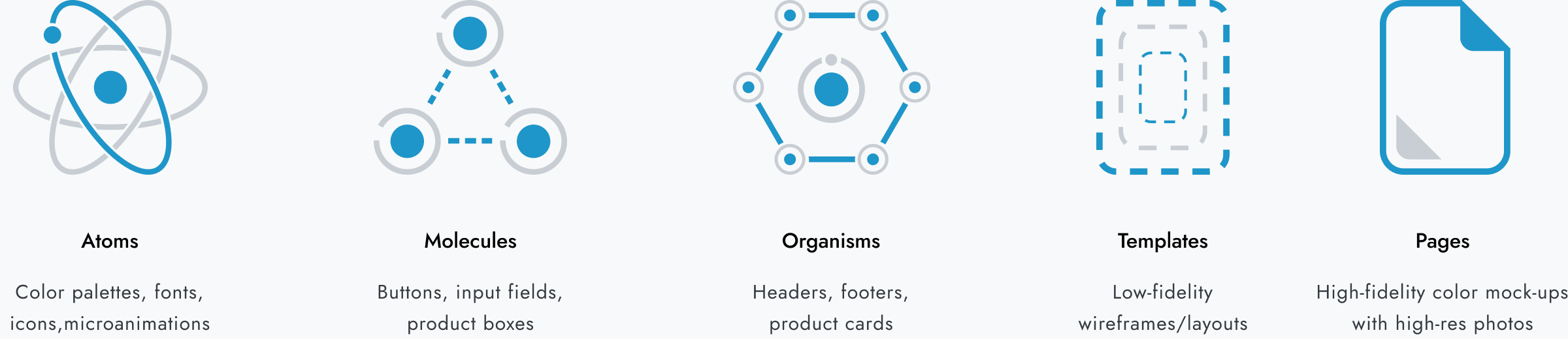
ATOMIC DESIGN
I’m a big fan of Brad Frost. In 2013 he created his design manifesto called Atomic Design. Since then, it’s been embraced by most all serious designers looking to organize big things. Atomic design is a product design methodology that's based on a hierarchy of varyingly complex components. It's a mental model that helps you think of user interfaces as both a cohesive whole and a collection of parts at the same time.
“We’re not designing pages, we’re designing systems of components.”
Brad writes that the five stages of atomic design are atoms, molecules, organisms, templates, and pages. Atomic design was inspired by chemistry, which is why the building blocks are called atoms, molecules, organisms, templates, and pages. Atomic design is not a linear process. It's a modular approach that promotes consistent patterns across working documents and simplifies otherwise tedious workflows. The main advantage of atomic design is that the components are reusable. If you’re a big fan of Design Tokens, well... you’ve come to the right place.
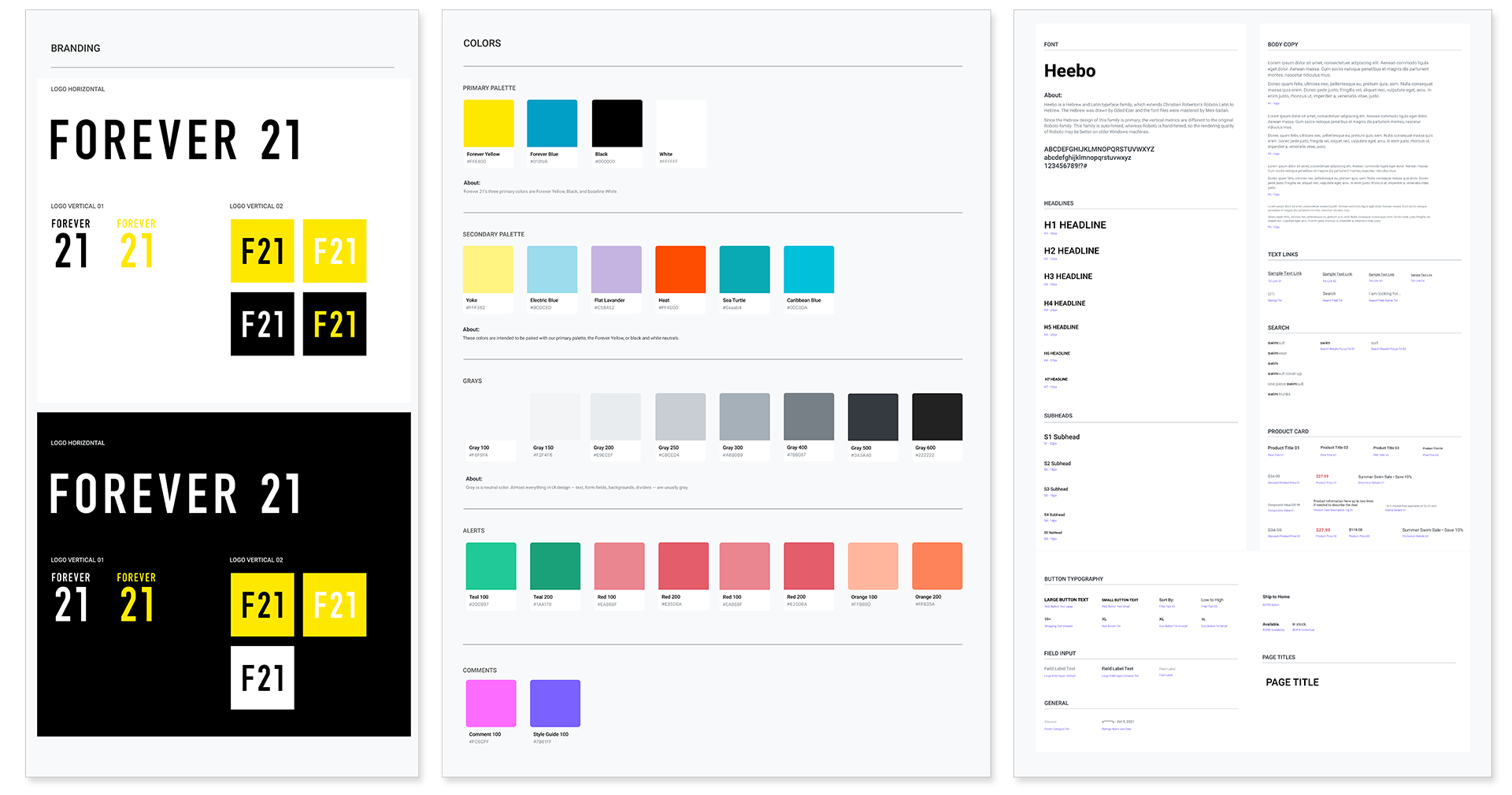
I took a look at the initial PDF sheet and knew we had a problem. It was a static document and didn’t give us the tools we needed to create things quickly with the development team. A design system rooted in Figma and accessible to the ENTIRE product, marketing, and business team was the best way to ensure everyone was on the same page and we could move FAST.
Forever 21 Design System
DESIGN SYSTEM AND COMPONENTS
WAAAAY TOO MUCH STUFF
After the bankruptcy, Forever 21 built web and app components based on the SalesForce platform. The focus was on basic sales infrastructure to stay afloat, which is a good start. However, the brand didn't flow seamlessly across digital channels. Some big customer complaints:
“There is too much on the screen at one time…”
“It seems like its several sites smashed together, I’m lost…”
“You’re killing me with the pop-ups…”
WAIT! I've seen this before!
We huddled with the business and engineering team to test some hypotheses:
Customer Journey Maps are critical for a better experience.
Components were created in isolation and competed on pages, causing confusion.
Third-party apps dominated our website, leading to disjointed journeys.
Popups frustrated customers, associating them with cheap brands.
DESIGN SYSTEM AND COMPONENTS
PRIORITY INITIATIVES
We had a lot of work to do, so we prioritized the roadmap to focus on larger money-making initiatives first. When you have limited time and resources, strategy ensures you can have enough money to support other initiaitves. Here’s what we focused on.
SEARCH
We quickly discovered that Search was underutilized by our users at only 11% of traffic towards our PDP pages. Our users were missing the search icon and were forced to go through our menu taxonomy.
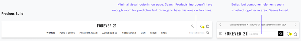
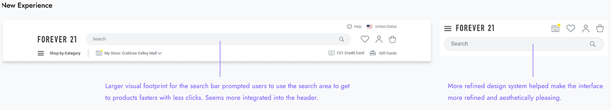
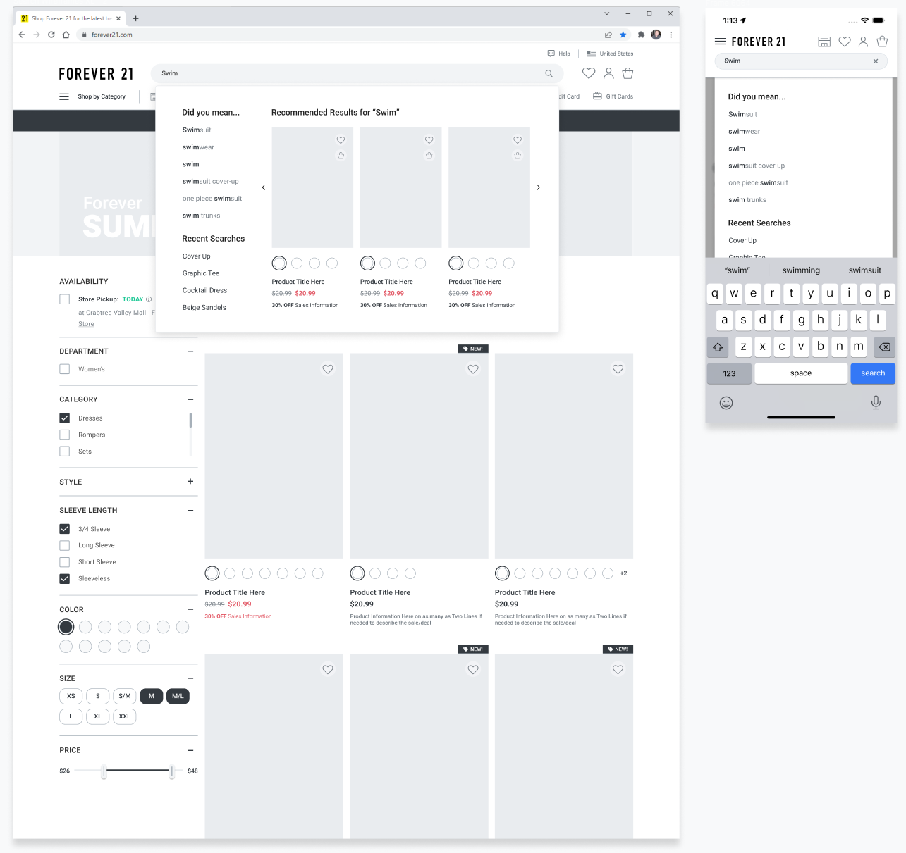
Soon after we reconfigured the search area, we saw a improvement jump of 12% and the use of search stayed at 23% for both website and app channels. Predictive search helped include additional upsell opportunities which also boosted sales for both channels.
Baymard Principles Applied:
#377 Prominently Display the Total Number of Results
#386 Adjust Product Thumbnails to Match the Variation Searched For
# 379 Autoswitch the Results Layout to Match the User’s Query
# 401 Order Category Filter Options by their Relevance to the Query
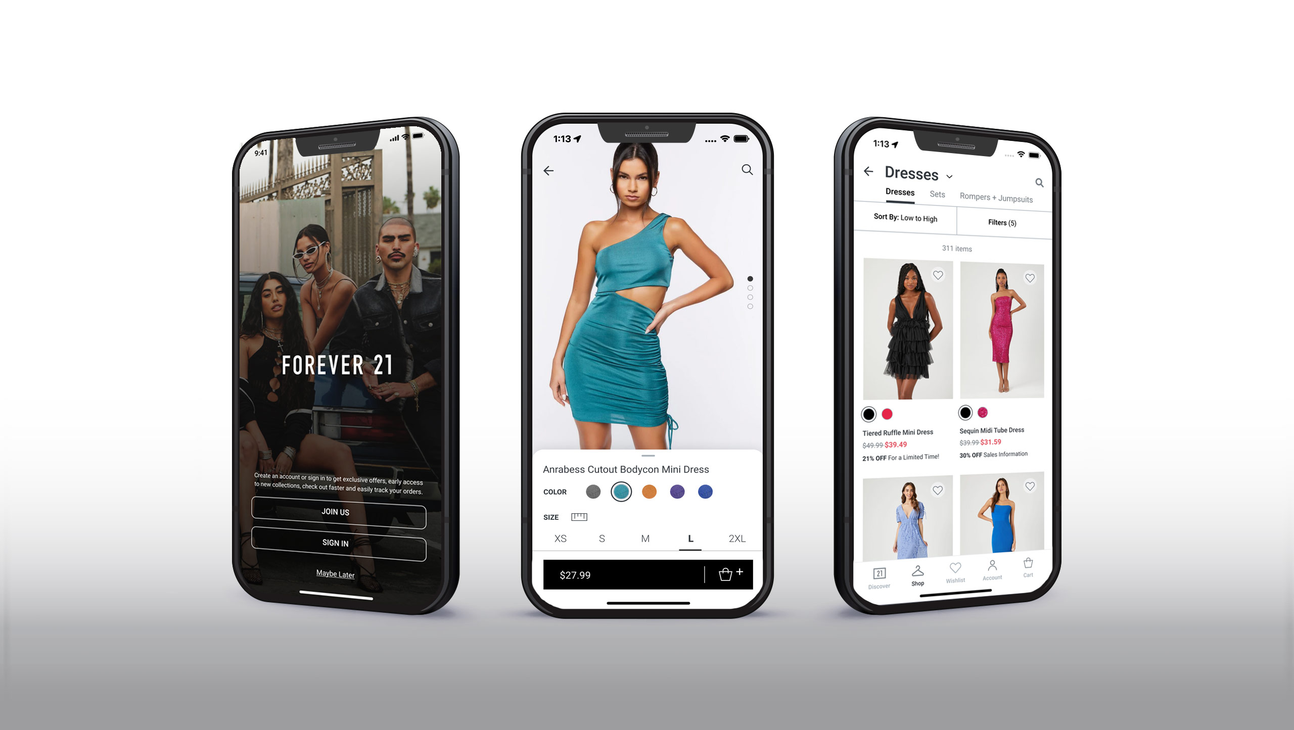
FOREVER 21 APP
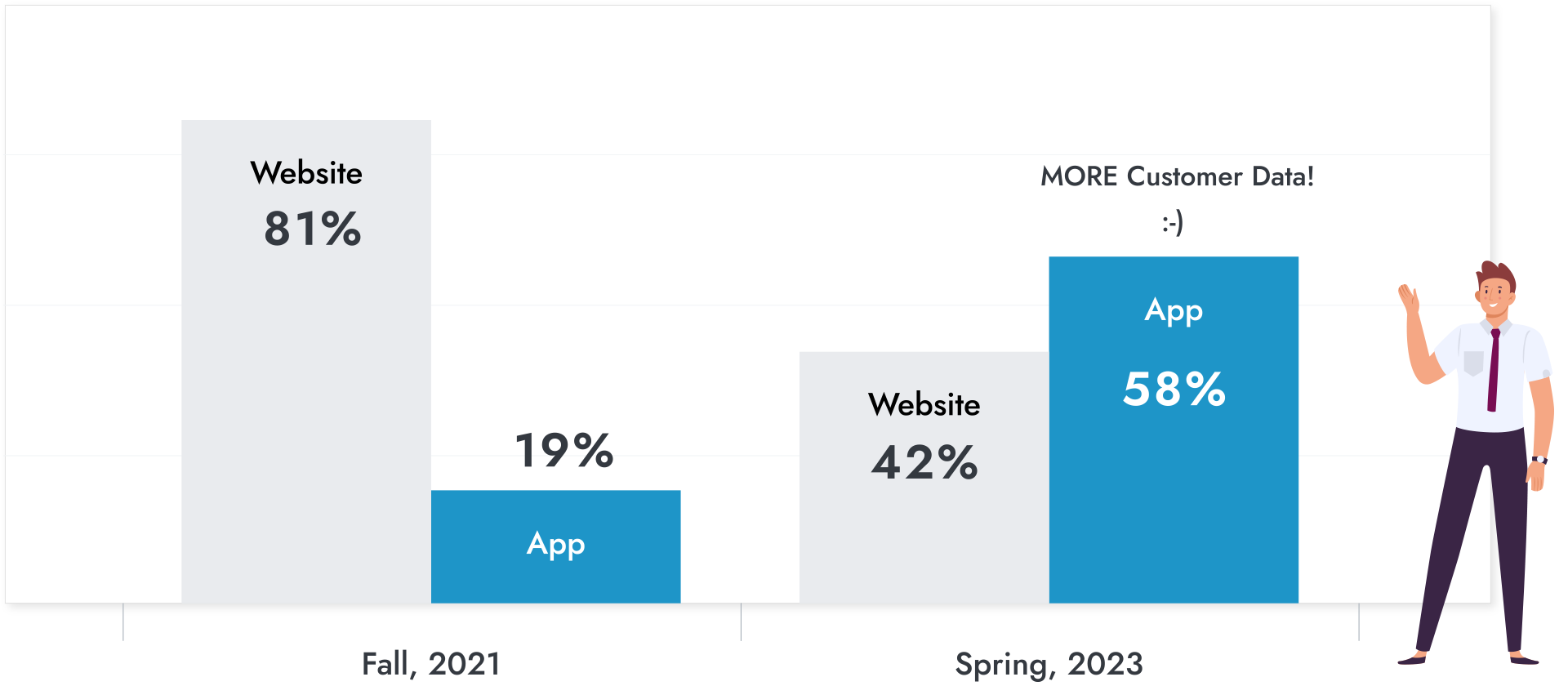
MAKING THE APP OUR PRIMARY DIGITAL CHANNEL
Forever 21's native App was limping along only accounting for 19% of digital sales. This made sense in that after the Forever 21 team emerged from bankruptcy, the team had limited resources to support a native app with the attention that it really needs.
After 9 months, we were able to boost the App revenue channel from 19% to 58%.
So, why all the fuss?
Customer experience: Apps allow customers to search for products, place orders, and make payments from anywhere.Customer loyalty: Apps allow businesses to directly interact with customers and cultivate loyalty.Personalization: Apps allow digital buyers to connect with brands and feel special.Brand awareness: Apps improve brand recognition as soon as a consumer downloads them.Conversion rate optimization: Apps increase the number of visitors who become leads or customers.Reduced cart abandonment: Apps have a 20% cart abandonment rate, compared to the 69.5% average rate for the ecommerce sector.Efficiency: Apps can notify businesses if an item is out of stock and bring it back to the warehouse before losing potential customers.Revenue generation: Apps can help with revenue generation and conversion rate optimization.Competitive advantage: Apps can help businesses keep one step ahead of the competition.
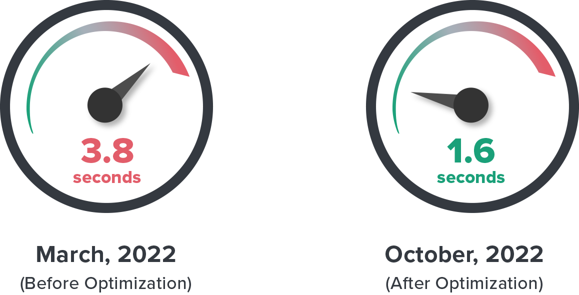
Fixing Slow Load Speeds
A recent Forrester and Akamai study found that 47% of ecommerce customers expect pages to load in under 2 seconds, with 40% abandoning if it takes over 3 seconds. We prioritized both perceived and actual load times, aiming for a page paint down to 1.8 seconds. The graphics on key pages were optimized. We addressed poor coding, cached data, App crashes, ad lazy loading in a series of sprints that we monitored very closely. My role was to work with the engineers, product managers, and balance the needs to marketing & business stakeholders while protecting the customer experience. With all of this hard work, we got the load times on most pages down to 1.6 seconds.
App Page Load Speed Improvements
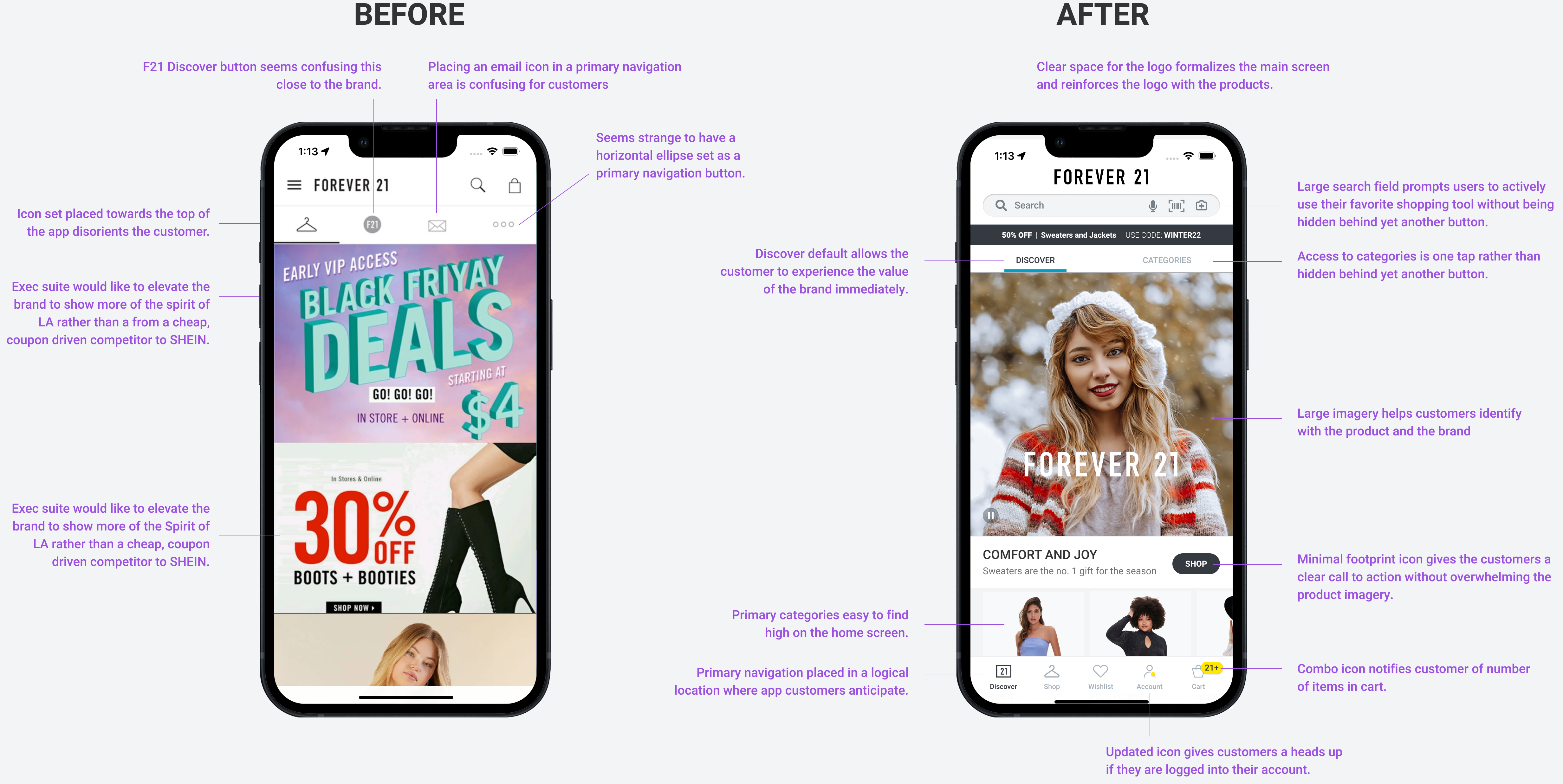
Confusing Discovery Screen
A recent Forrester and Akamai study found that 47% of ecommerce customers expect pages to load in under 2 seconds, with 40% abandoning if it takes over 3 seconds. We prioritized both perceived and actual load times, aiming for a page paint down to 1.8 seconds. The graphics on key pages were optimized. We addressed poor coding, cached data, App crashes, ad lazy loading in a series of sprints that we monitored very closely. My role was to work with the engineers, product managers, and balance the needs to marketing & business stakeholders while protecting the customer experience. With all of this hard work, we got the load times on most pages down to 1.6 seconds.
App Discovery Screen Improvements
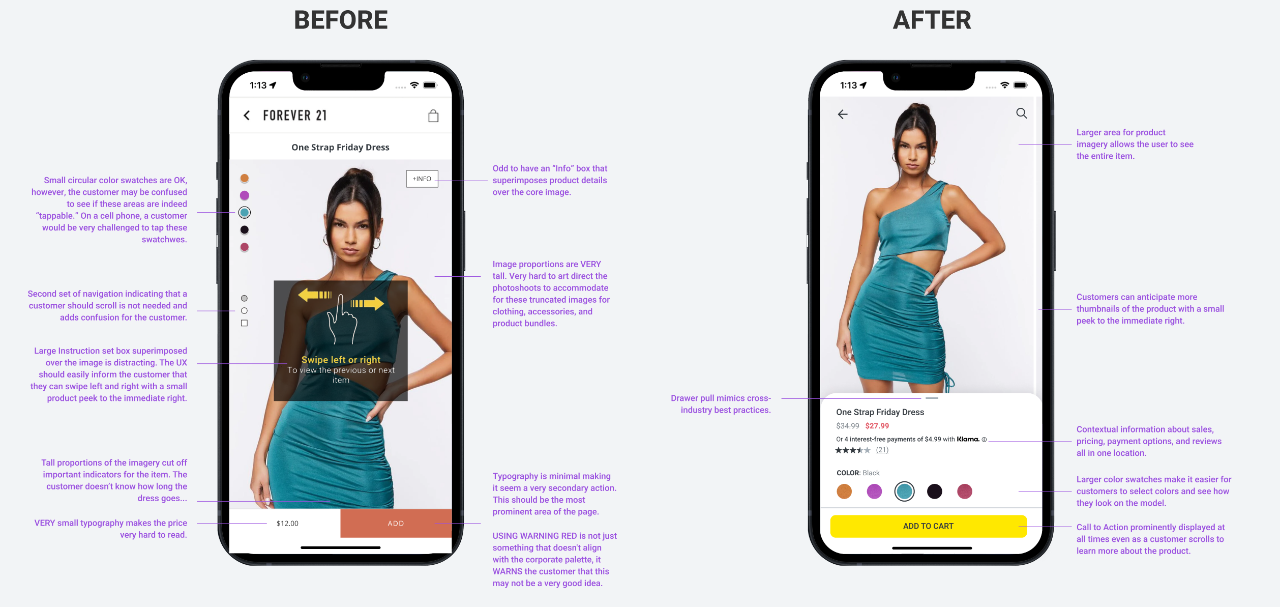
Poor User Experience on the App Product Display Page
A recent Baymard Institute study that only 56% of e-commerce sites have an overall “decent” or “good” UX performance for their product pages, while 44% of sites have “mediocre” or worse product page implementations. That leaves a ton of sales on the table for ecommerce sites wishing to close more deals and open up new income streams. The Forever 21 App Product Display Page was functional but had so many opportunities for enhancement. My role was to work with the engineers, product managers, and balance the needs to marketing & business stakeholders while protecting the customer experience. I was much more than a cheerleader for this project, I designed the entire UX/UI design of the page and how it interfaces into the larger wheels of the sales funnel. We spent a ton of time and resources on this initiative and in over 6 months, our investment was able to raise the conversion rate 116%.
App Product Display Page Improvements
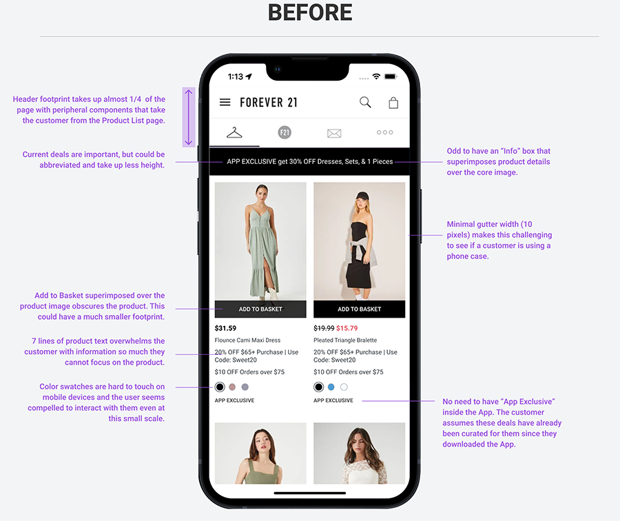
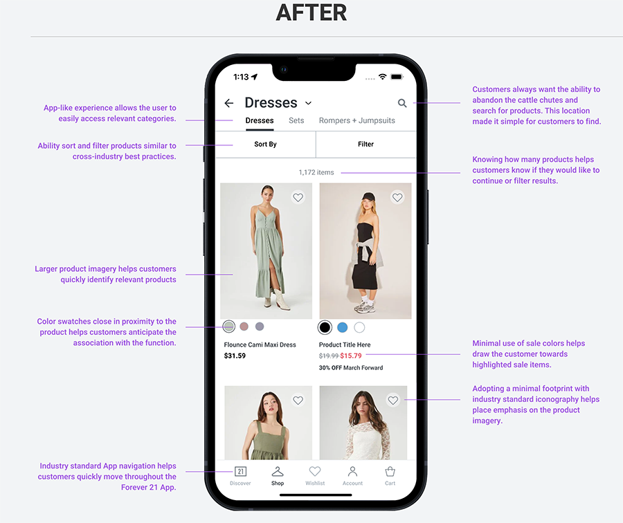
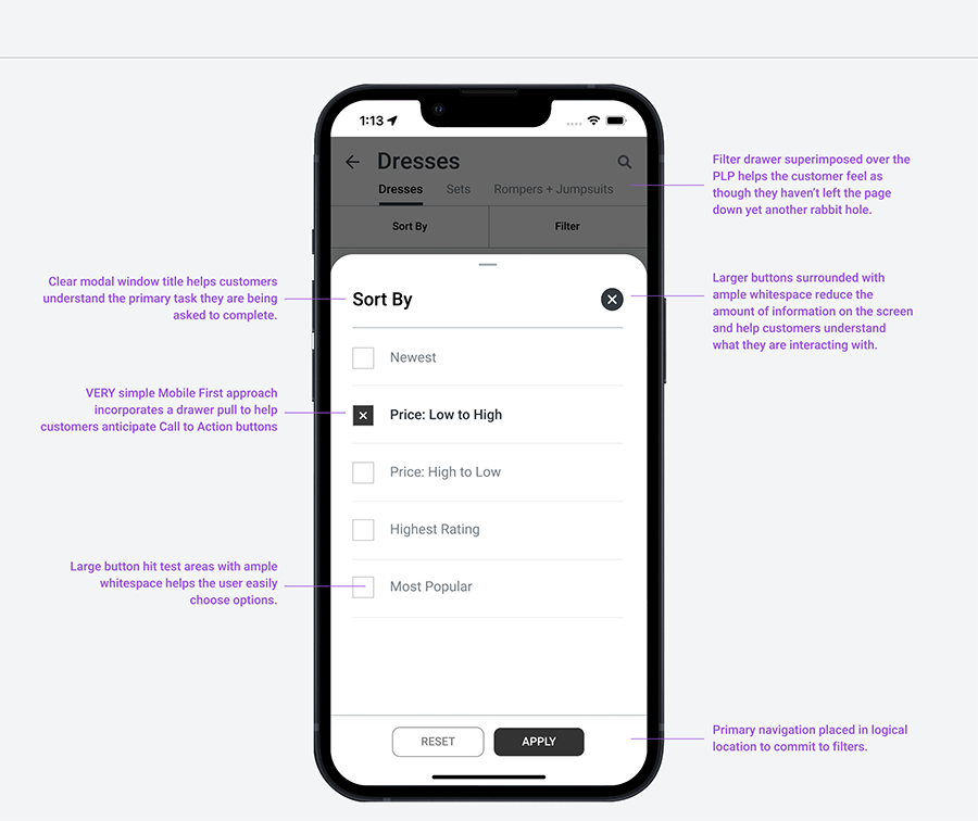
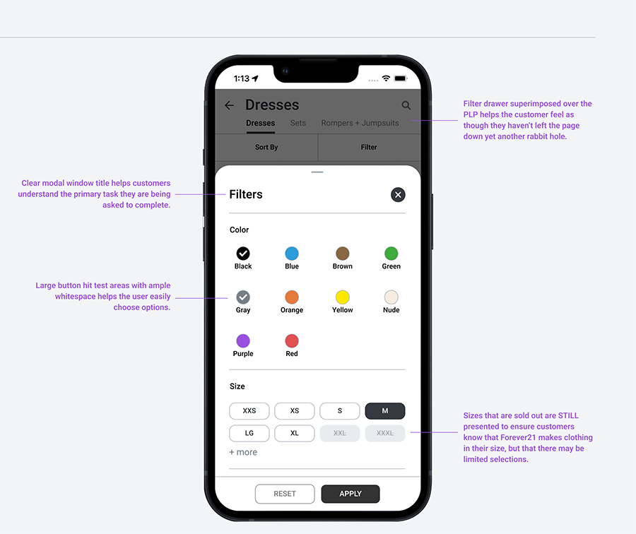
Confusing Product Lists and Filtering Throughout the App
Without the right tools, finding just the right product can be an almost impossible task for the user. E-commerce product lists and their filtering and sorting tools determine how easy or difficult it is for the user to browse the site’s product catalog. This was critical because, after all, if users can’t easily browse your product lists, they can’t easily find what they are looking for – and if they can’t find it, they can’t buy it. The initial product cards for the Forever21 app were clogged with way too much peripheral information, most of which should have been reserved for the Product Display page. The Search bar was poorly placed, and the taxonomy of the product catalog forced customers to constantly guess where they were headed within the sales funnel. We worked on the tech stack first and removed several underperforming tools and simplified the experience so customers could easily add things to their cart or head onwards towards the Product Display page.
App Product Listing Screen Improvements
FOREVER 21 WEBSITE
WEBSITE PRODUCT DISPLAY PAGES
Forever 21's PDP (Product Detail Page) was highly disorganized on both the website and the App, with components scattered in odd places. Customers had to put in significant effort to locate pricing, sizing, and relevant discounts. Their confusion with the page prompted us to prioritize improvements in this area to enhance customer satisfaction and boost conversions.
Discovery
We worked with marketing, and business teams and found they too were not very happy with the page. We looked for quick wins, but a major overhaul was clearly in order.
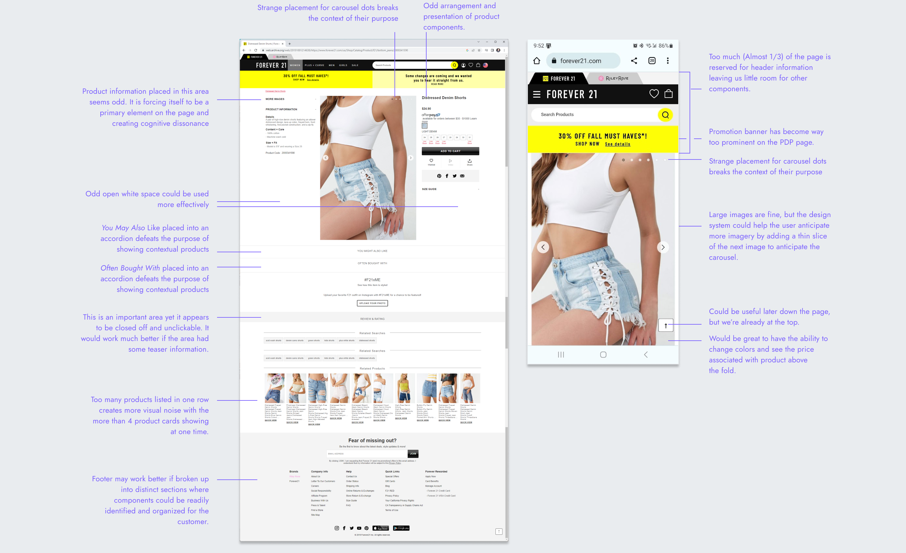
Wireframes
Salesforce Commerce Cloud is a basic system, but collaborating with engineering partners allowed us to enhance the customer experience. We focused on improving the layout with impactful imagery and strategically placing contextual product choices, such as color, size, and shipping options, in close proximity. This approach empowered customers with the necessary tools to make informed decisions.
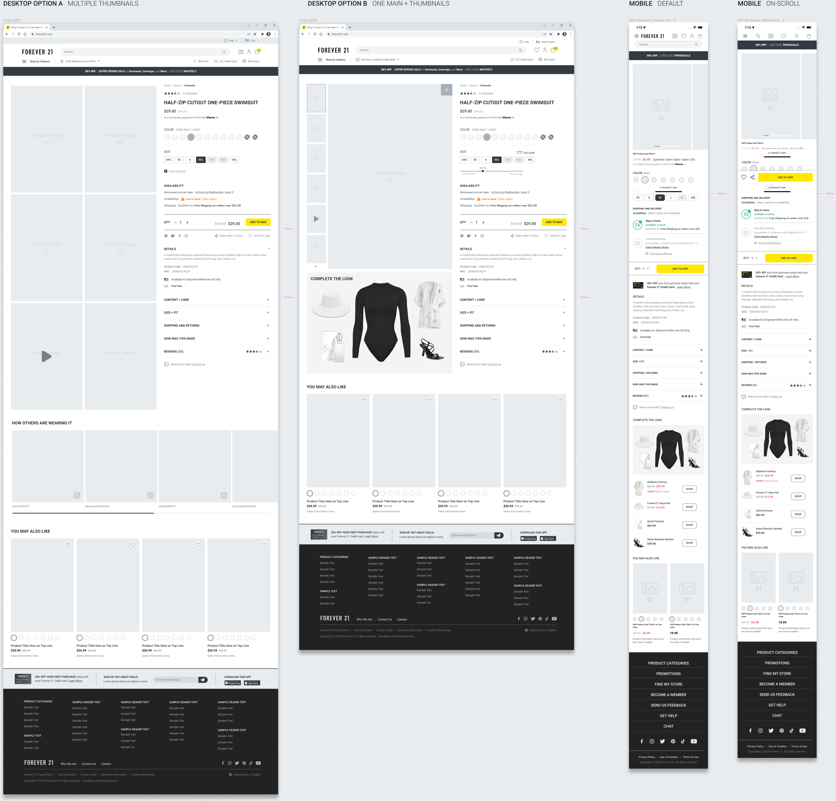
Hi-Fidelity Mock Ups
A short video explaining how we brought it all of our work together to improve the PDP experience.
THE IMPACT
Hitting KPI Objectives, and Then some.
In just over 12 months, we worked with the business and marketing teams to assess where we needed to improve our KPIs and we were proud to move the needle in the right direction.
Mobile First Initiative
Moving customers to the App gave our team access to critical data best gathered from a native app. In just over a year, premier customers downloaded and used the Forever 21 app, providing us with more data for each customer journey.
Forever 21 Percentage of Digital Sales
Core KPI Improvements