THE CHALLENGE
Emerging from bankruptcy in 2019 and the turbulence of the 2020 pandemic, Forever 21 faced intense competitive pressure from fast-fashion disruptors like SHEIN. Under the SPARC Group’s ownership, revitalizing this flagship brand became a mission to rebuild from the ashes—preserving what was working while embedding modern UX and eCommerce best practices.
THE SOLUTION
We unified design and product strategy through a single federated design system—restoring consistency, scalability, and visual harmony. This modular framework became the foundation of Forever 21’s eCommerce experience, delivering a seamless, on-brand journey across web, mobile, and app, and now supports SPARC Group’s wider portfolio of brands.
Pain Points
"I love Forever 21’s style, but shopping online doesn’t feel the same. It’s slow, confusing, and doesn’t capture the excitement of the brand I know."
These small moments of friction added up—minor frustrations that, at scale, had a major impact on customer satisfaction and brand perception.

Disjointed Shopping Journey
Customers experienced friction moving through the sales funnel, with inconsistent design and unclear navigation between web and app—creating confusion and cart abandonment.

Lack of Brand Cohesion and Premium Feel
The digital experience didn’t reflect Forever 21’s renewed vision as a modern, fashion-forward brand. Outdated visuals and uneven UX undermined customer confidence.

Slow and Unoptimized Mobile Experience
With most traffic coming from mobile web and native app, lagging performance and unrefined mobile flows frustrated high-intent users, reducing conversion and loyalty.

Missed Opportunities for Loyalty and Personalization
App users—often the most loyal segment—received little differentiation or reward, weakening retention and the emotional connection with the brand.
KNOW YOUR CUSTOMER
You can’t design what you don’t understand.
We started by listening to customers, associates, and the data. Journey maps, personas, and firsthand immersion revealed where delight turned to friction. Those insights shaped the foundation of our modern Forever 21 experience and guided our UX strategy and design system.


Design Decisions and Strategy
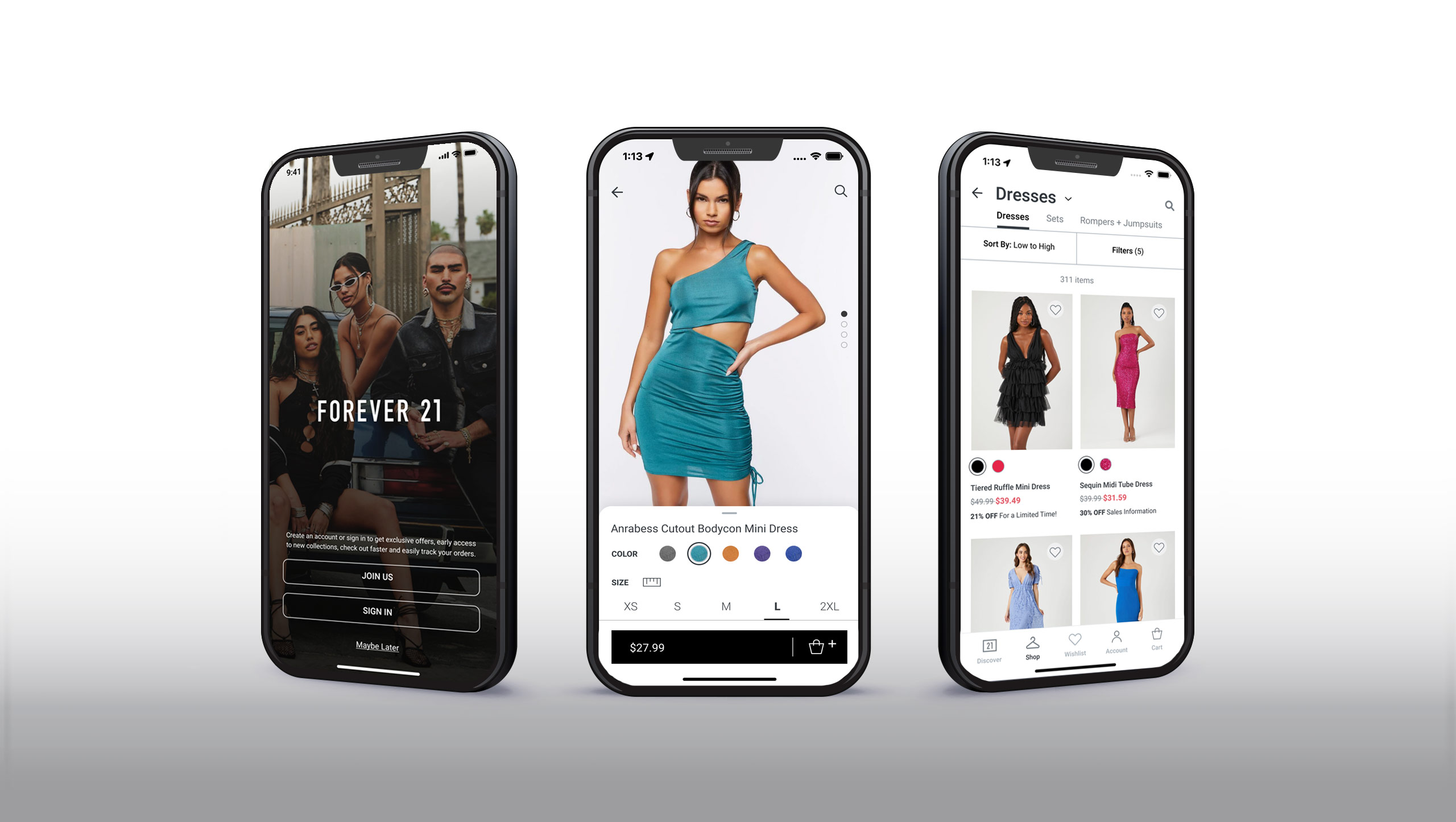
1. Establish Brand & Design System Cohesion


2. Rebuild Core User Journeys (PLP, PDP, and Checkout)
Summary: Streamline discovery, comparison, and purchase flows for both mobile and desktop.
Why second: These are the money pages,—the heart of conversion. Friction here directly impacts revenue.
Product Listing Page (PLP)

Product Display Page (PDP)

Checkout

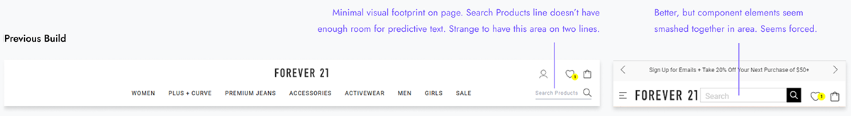
3. Fix Search, Navigation, and Information Architecture
Summary: Help customers find what they want faster with better taxonomy, predictive search, and clear navigation.
Why third: A fast-fashion customer often comes searching for something specific—if search fails, so does conversion
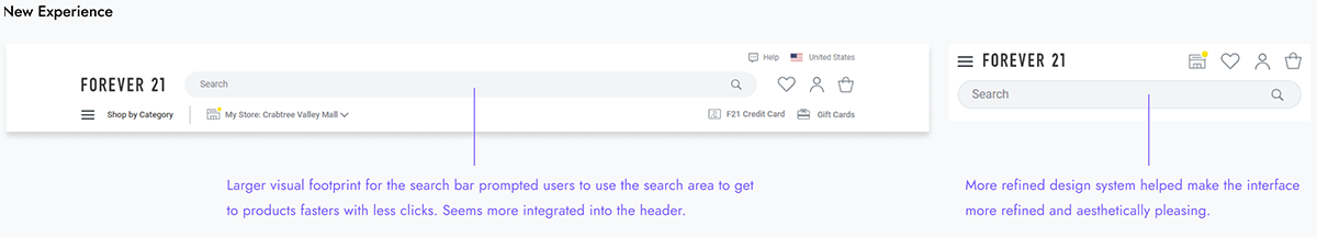
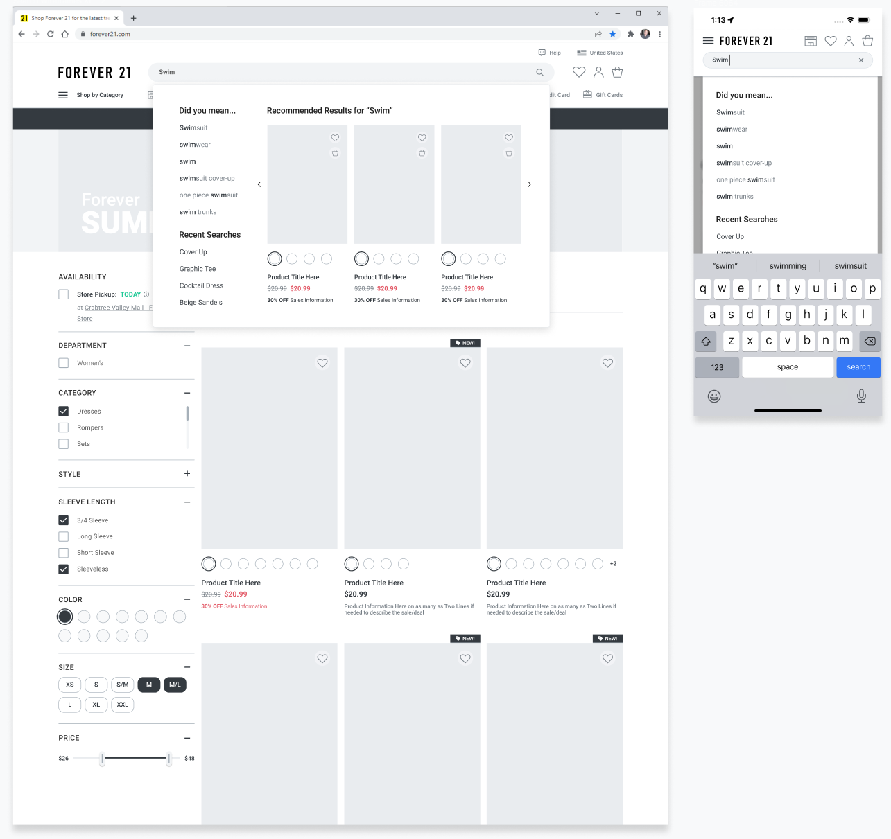
Search
We quickly discovered that Search was underutilized by our users at only 11% of traffic towards our PDP pages. Our users were missing the search icon and were forced to go through our menu taxonomy.
Navigation
A modernized navigation system corrected the underlying information architecture, helping customers shop the way leading e-commerce experiences have trained them to.

4. Integrate Data, Feedback, and Experimentation
Summary: Build a culture of continuous improvement through analytics and testing.
Why fourth: Once the foundation is stable, data-driven iteration sustains long-term growth and innovation.
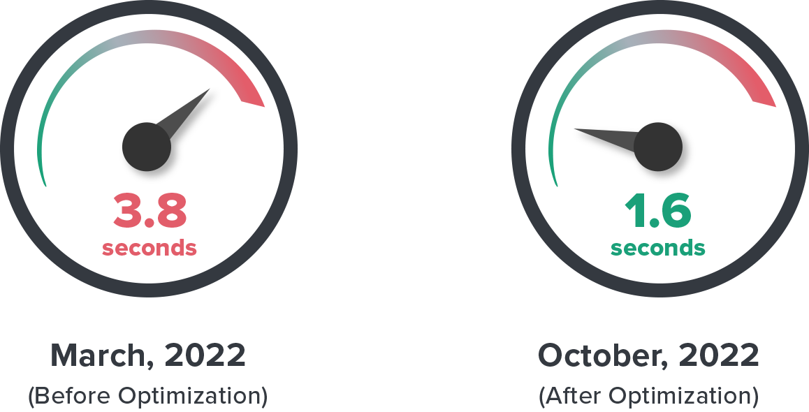
Fixing Slow Page Load Speeds
A Forrester–Akamai study showed nearly half of customers expect pages to load in under 2 seconds, and many leave if it takes over 3. We focused on improving both perceived and actual speed, targeting a 1.8-second paint. I partnered with engineering and product teams to optimize graphics, clean up code, improve caching, fix crashes, and implement lazy loading. Through tightly monitored sprints, we brought most pages down to 1.6 seconds.