OVERVIEW
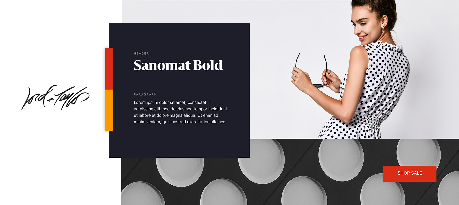
Lord & Taylor is an American luxury department store chain, and the oldest department store in the United States with the flagship store at the Lord & Taylor Building on Fifth Avenue in New York City operating since 1914.
The Challenge
In the summer of 2019, Lord and Taylor, was struggling with the challenges of operating 38 stores as the business model of operating large department stores became very challenging to maintain. In early days of the pandemic, the company understood physical stores would soon be closing, and digital commerce may be the only option to remain a viable company. The current sales funnel on their ecommerce platform was limping along, but had much more potential as we smoothed out the customer experience throughout all digital channels.
The Solution
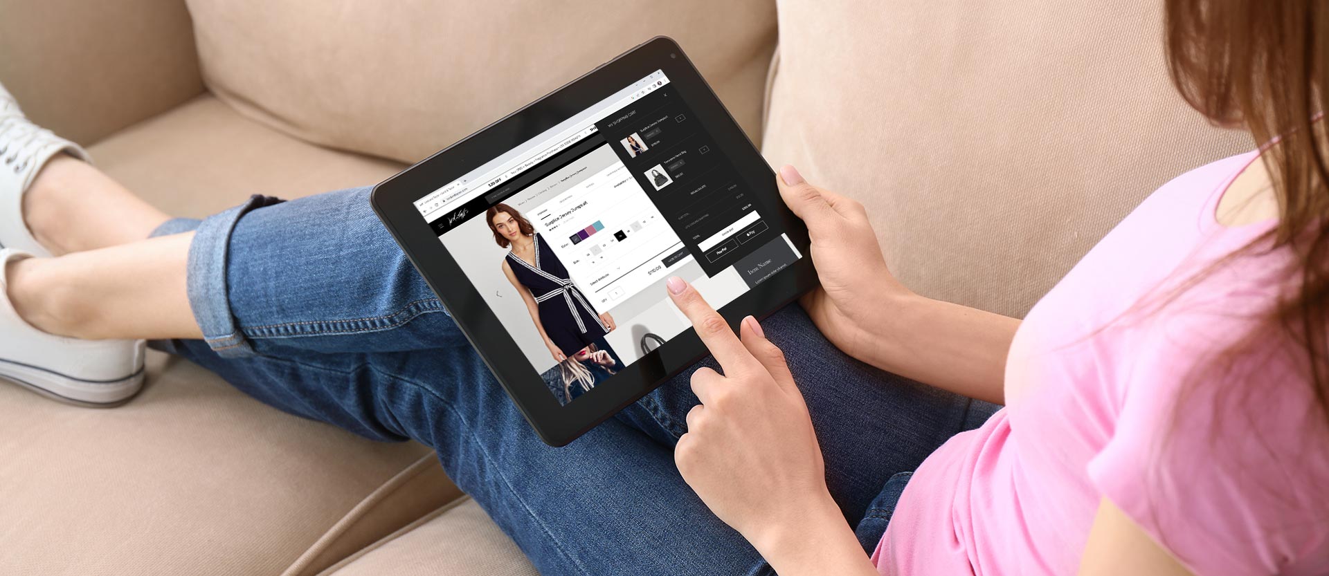
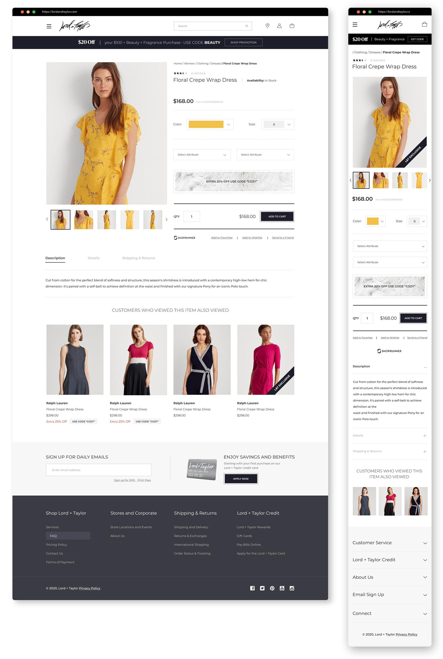
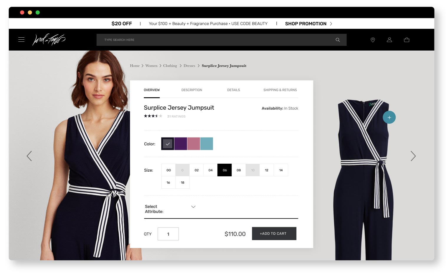
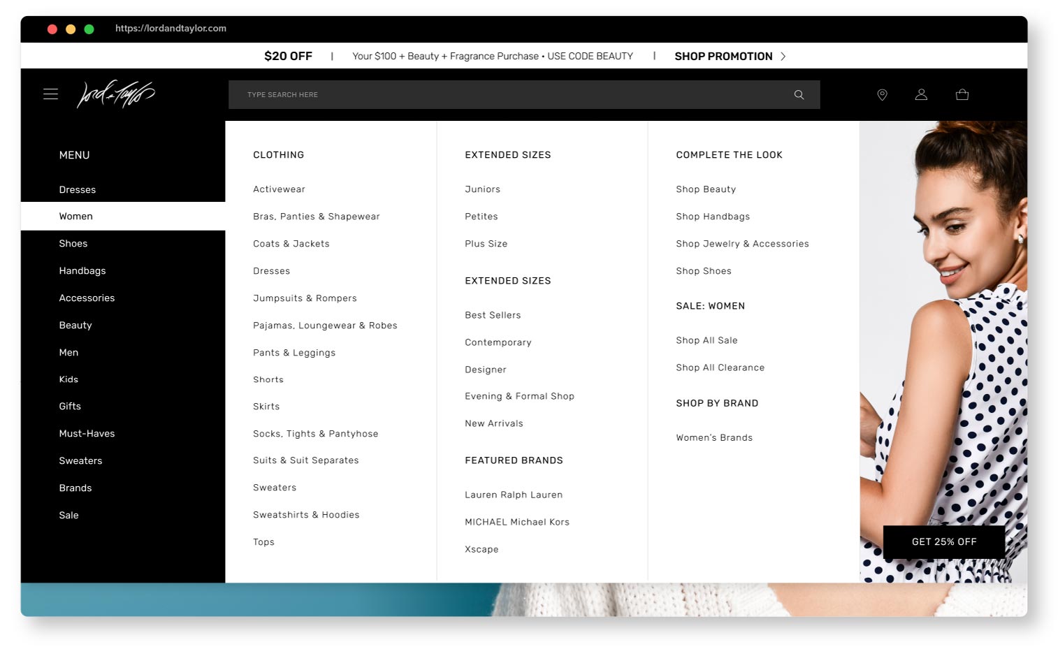
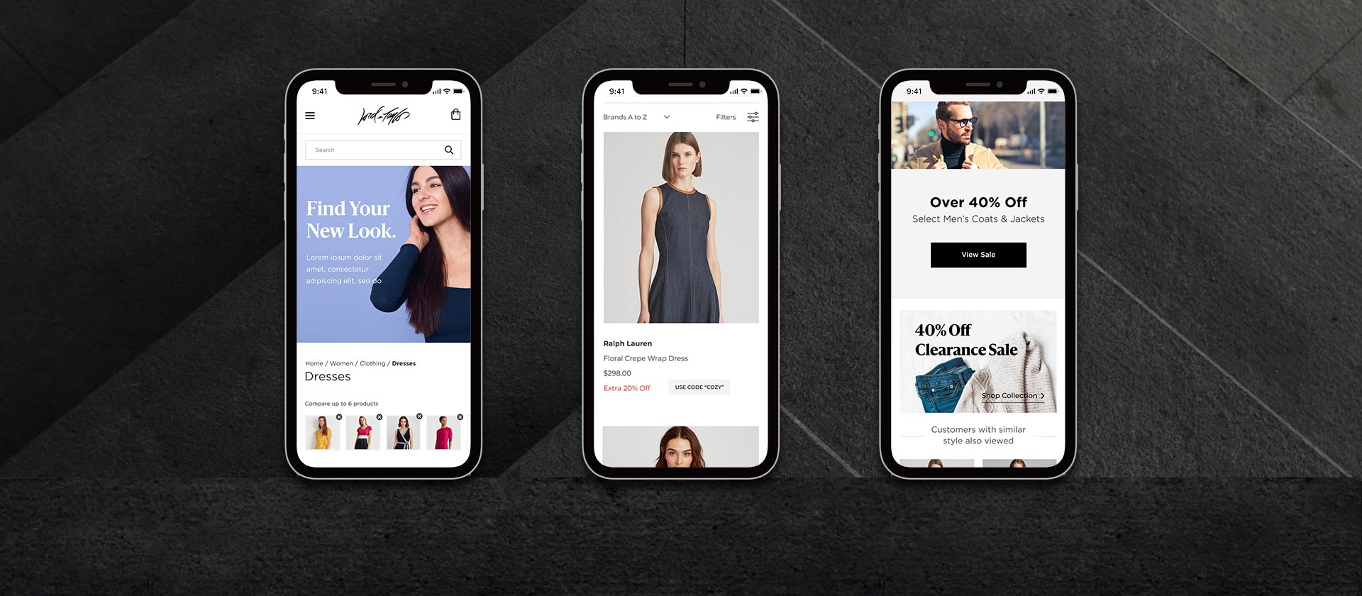
I spoke with several personas that shopped the L&T brand as well as other competitors in the space. I also conducted a heuristics audit of the website and noted many areas for improvement for the home page, PLP, PDP, and checkout. The UX/UI updates helped improve brand recognition, cobranded product bundles, average order values, and conversion rates. Many of these suggestions were implemented shortly before Lord and Taylor declared bankruptcy in August 2020. I was happy to see that many of the improvements live on the site as the new owners took the reins of the company.
RESPONSIBILITIES
UI Design
UX Design
Branding
Challenge
In the summer of 2019, Lord and Taylor, was struggling with the challenges of operating 38 stores as the business model of operating large department stores became very challenging to maintain. In early days of the pandemic, the company understood physical stores would soon be closing, and digital commerce may be the only option to remain a viable company. The current sales funnel on their ecommerce platform was limping along, but had much more potential as we smoothed out the customer experience throughout all digital channels.
The Solution
I spoke with several personas that shopped the L&T brand as well as other competitors in the space. I also conducted a heuristics audit of the website and noted many areas for improvement for the home page, PLP, PDP, and checkout. The UX/UI updates helped improve brand recognition, cobranded product bundles, average order values, and conversion rates. Many of these suggestions were implemented shortly before Lord and Taylor declared bankruptcy in August 2020. I was happy to see that many of the improvements live on the site as the new owners took the reins of the company.
RESPONSIBILITIES
UI Design
UX Design
Branding


